
Color Blocking
Bold And Modern Interior Design With Colorful Zones
Are you tired of plain and boring interiors? Spice up your space with color blocking!
In this article, we’ll show you how to create a bold and modern interior design using colorful zones. You’ll learn about color theory, choosing the right color palette, and planning your color zones.
We’ll also give you tips on selecting the perfect paint colors, creating harmony with color transitions, and considering lighting and reflection.
So get ready to embrace color blocking and transform your rooms into vibrant and stylish spaces!

Key Takeaways
- Wallpaper can be used to create colorful zones and add dimension to walls.
- Balancing bold colors with neutrals is important to create a harmonious color palette.
- Accent colors can be used to highlight specific areas and add visual interest.
- Color blocking can be embraced in different rooms to create a modern and bold interior design.
Understanding Color Theory
To truly understand color theory, you’ll need to explore the relationships between different hues and how they can create dynamic and visually appealing interiors. By understanding the basics of color theory, you can effectively use color to transform any space into a vibrant and inviting environment.
Start by learning about the color wheel and primary, secondary, and tertiary colors. Next, delve into the concepts of color harmony and contrast. Complementary colors, located opposite each other on the color wheel, create a striking contrast when used together. Analogous colors, found next to each other on the wheel, create a harmonious and cohesive look.
Additionally, understanding the psychological effects of color can help you create the desired atmosphere in each space. When you have a solid grasp of color theory, you can confidently experiment with different color combinations and create stunning interiors.
Choosing the Right Color Palette
When creating your color palette, it’s essential to consider the mood and atmosphere you want to achieve. Think about how you want your space to make you feel, whether it’s calm and serene or vibrant and energized. Here are some tips to help you choose the right colors:
- Consider the function of the space:
- For a bedroom, soothing colors like blues and greens can promote relaxation and better sleep.
- In a home office, choose colors that inspire productivity and focus, such as shades of yellow or orange.
- Take into account your personal preferences:
- If you love bold and vibrant colors, don’t be afraid to incorporate them into your color palette.
- On the other hand, if you prefer a more neutral and understated look, opt for softer tones or shades of white and gray.
Planning Your Color Zones
Consider creating different zones within your space to designate specific color palettes for different purposes. This approach allows you to add depth and personality to your interior design while maintaining a cohesive overall look. By strategically dividing your space into color zones, you can create a bold and modern aesthetic that is visually engaging. Use vibrant colors in areas where you want to energize and stimulate, while opting for softer shades in spaces meant for relaxation and tranquility. To help you visualize and plan your color zones, here is a table showcasing some potential color palettes for different areas of your home:
| Zone | Purpose | Color Palette |
|---|---|---|
| Living Room | Socializing | Warm Neutrals |
| Home Office | Productivity | Cool Blues |
| Bedroom | Relaxation | Soft Pastels |
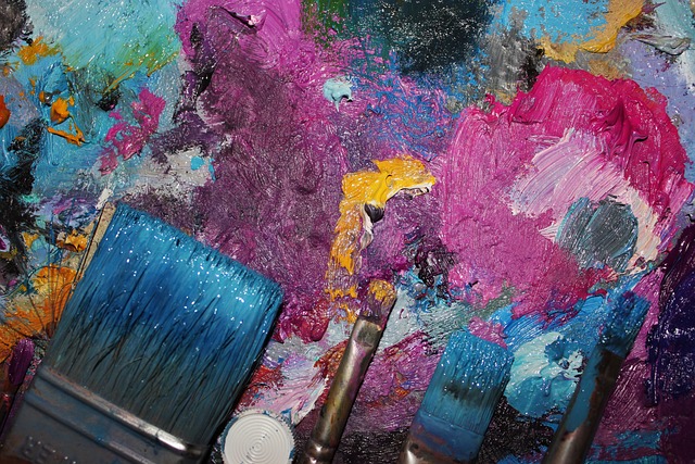
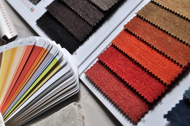
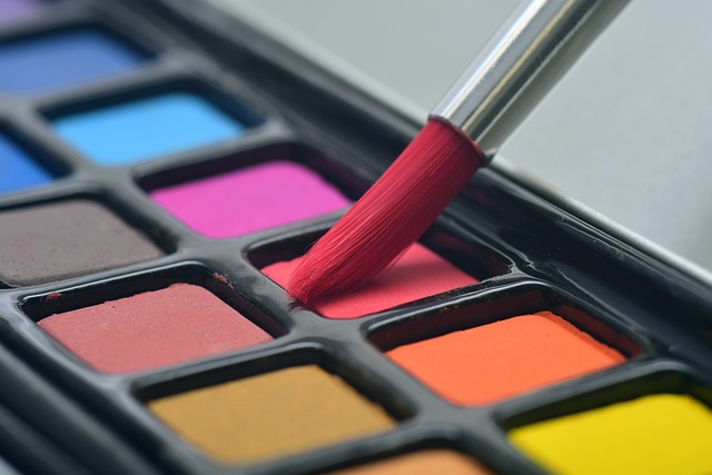
Selecting the Perfect Paint Colors
Once you’ve narrowed down your options, it’s time to start selecting the perfect paint colors for each zone in your home. This is where the fun begins!
Consider the mood and atmosphere you want to create in each space. Do you want a calming and serene bedroom? Or a vibrant and energetic living room? Think about the function of each zone and how you want it to make you feel.
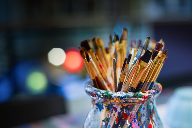
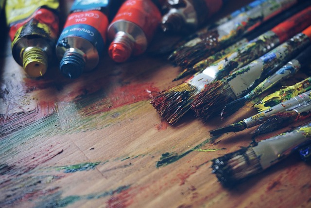
Look at color swatches and paint samples to get an idea of what resonates with you. Don’t be afraid to go bold and experiment with different shades and combinations. Remember, paint is not permanent and can always be changed if you’re not satisfied.
Trust your instincts and go with colors that make you happy and reflect your personal style.
Get ready to transform your home into a colorful oasis!

Creating Harmony with Color Transitions
When it comes to creating a harmonious flow between zones in your space, using transition colors is key. These colors help to seamlessly blend different areas together, creating a cohesive and visually pleasing look.
Experimenting with techniques like ombre or gradient effects can add an extra level of interest and depth to your design, allowing you to truly customize the transition between zones.
Use transition colors to create a smooth flow between zones
To create a smooth flow between zones, you can use transition colors that seamlessly connect different areas of your bold and modern interior design. By incorporating these transition colors, you can create a cohesive and visually appealing space that flows effortlessly from one zone to another.
Here are five ideas on how to use transition colors effectively:
- Choose colors from the same color family to create a subtle transition between zones.
- Use a gradient effect by selecting colors that gradually change from one zone to another.
- Incorporate accent colors that complement the main colors in each zone to create a harmonious transition.
- Experiment with different shades and tones of the same color to add depth and dimension to your design.
- Consider using transitional elements such as rugs, artwork, or furniture pieces that feature a combination of colors to visually connect different areas of your interior.
Experiment with different techniques, such as ombre or gradient effects
If you want to add a touch of creativity to your space, try experimenting with different techniques like ombre or gradient effects. These techniques can bring a unique and modern look to your interior design. With ombre, you can create a beautiful transition of colors, blending from one shade to another. Gradient effects, on the other hand, allow you to create a smooth and seamless flow of colors, going from light to dark or vice versa. To give you some inspiration, here are a few ideas for incorporating ombre or gradient effects into your space:
| Idea | Ombre Effect | Gradient Effect |
|---|---|---|
| Walls | Paint a gradient on one wall for a striking focal point. | Use wallpaper with a gradient pattern for a subtle yet stylish look. |
| Furniture | Repaint a piece of furniture with an ombre effect for a bold statement. | Choose furniture with upholstery that has a gradient design for a contemporary touch. |
| Accessories | Use ombre curtains or rugs to add a touch of color and depth to your space. | Incorporate gradient throw pillows or artwork for a pop of color in your room. |
Incorporating Patterns and Textures
When it comes to adding visual interest to your space, don’t be afraid to mix and match patterns. By combining different patterns, such as stripes and florals, you can create a dynamic and eclectic look.
Another way to add texture to your walls is by using materials like wallpaper or textured paint, which can give your space a unique and dimensional feel.
Mix and match patterns to add visual interest
You can easily add visual interest to your interior design by mixing and matching patterns. By combining different patterns, you can create a dynamic and vibrant space that reflects your unique personality.
Start by choosing a dominant pattern that will serve as the focal point of the room. Then, add complementary patterns that enhance and balance the overall look. Don’t be afraid to mix different scales and styles of patterns for a more eclectic and interesting effect.
For example, pair a large floral print with a smaller geometric pattern or a bold stripe with a subtle polka dot. Remember to consider the color palette of the patterns and ensure they complement each other.
With a little experimentation and creativity, you can transform your space into a visually stimulating and stylish oasis.
Consider using textured materials, such as wallpaper or textured paint
Consider using textured materials, like wallpaper or textured paint, to add depth and visual interest to your space. Textured materials not only provide a tactile experience but also create a dynamic and captivating environment. Here are some ideas to inspire you:
- Faux brick or stone wallpaper: Bring the rustic charm of exposed brick or the elegance of natural stone into your home without the hassle of installing the real thing.
- Grasscloth wallpaper: Embrace the natural beauty of woven grass fibers for a touch of organic texture and a cozy atmosphere.
- Stucco or plaster textured paint: Achieve a timeless and sophisticated look with a textured wall finish reminiscent of old-world charm.
- Metallic wallpaper: Add a touch of glamour and luxury with metallic accents that catch the light and create a sense of opulence.
- Embossed wallpaper: Add dimension to your walls with raised patterns or motifs, creating an eye-catching focal point.
Experiment with different textures and let your creativity shine through to transform your space into a visually stunning haven.
Balancing Bold Colors with Neutrals
To achieve a balanced look, try pairing bold colors with neutral tones in your color blocked interior design. By combining vibrant hues with subtle shades, you can create a visually striking space that feels cohesive and modern. Bold colors draw attention and add energy to a room, while neutral tones provide a calming backdrop. To help you find the perfect balance, consider the following table:
| Bold Colors | Neutral Tones |
|---|---|
| Red | Beige |
| Blue | Gray |
| Yellow | White |
| Green | Taupe |
| Purple | Cream |
Use this table as a guide when choosing colors for your color blocked design. Remember, the key is to create a harmonious blend that showcases your bold choices while maintaining a sense of tranquility.
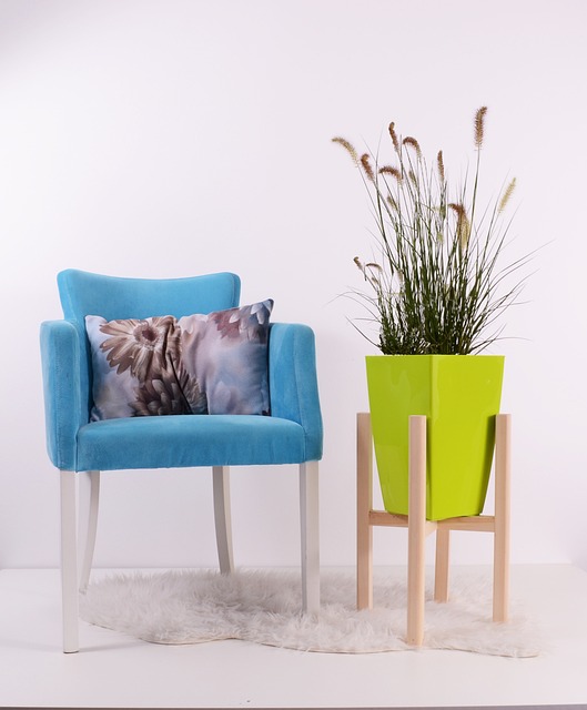
Adding Accents and Accessories
When it comes to adding accents and accessories to your space, consider using accent colors to highlight specific areas or features. By incorporating pops of color strategically, you can draw attention to focal points or create visual interest in your design.
Additionally, choose accessories, such as pillows or artwork, that complement your color scheme to create a cohesive and harmonious look throughout your space.
Use accent colors to highlight specific areas or features
Using accent colors is a great way to highlight specific areas or features in your interior design. By strategically incorporating pops of color, you can add visual interest and create focal points within a space. Whether it’s a vibrant hue on an accent wall, colorful throw pillows on a neutral sofa, or a bold rug in the center of a room, accent colors can instantly transform the look and feel of your home.
To help you get started, here’s a table showcasing different accent color options and the areas they can enhance:
| Accent Color | Areas to Highlight |
|---|---|
| Teal | Living room, bedroom, bathroom |
| Mustard Yellow | Kitchen, dining area, hallway |
| Coral | Home office, reading nook, entryway |
| Navy Blue | Bedroom, study, media room |
| Emerald Green | Dining room, bathroom, outdoor space |
Choose accessories, such as pillows or artwork, that complement your color scheme
Accessories like pillows or artwork that match your color scheme can enhance the overall aesthetic of your space. By choosing complementary accessories, you can create a cohesive and visually pleasing environment.
Here are three items to consider adding to your space:
- Colorful throw pillows: Adding throw pillows in coordinating colors can instantly liven up your space and tie together different elements. Choose pillows with bold patterns or textures to make a statement.
- Artwork in your color palette: Hang artwork that incorporates your chosen colors to create a focal point and add visual interest to your walls. Whether it’s a vibrant abstract painting or a series of photographs, artwork can bring personality and style to your space.
- Decorative vases or sculptures: Opt for vases or sculptures in colors that complement your color scheme. These decorative accents can serve as eye-catching pieces and add a touch of sophistication to your overall design.
Consider Lighting and Reflection
When it comes to enhancing the colors in your space, lighting plays a crucial role. Consider using different types of lighting fixtures to create a vibrant and dynamic atmosphere.
Additionally, it’s important to take into account how both natural and artificial light will affect the perception of color in your space. They can greatly influence the way colors appear and feel.
Use lighting to enhance the colors in your space
To really make the colors in your space pop, try using different types of lighting. Lighting plays a crucial role in enhancing the colors and creating a vibrant atmosphere in your home.
By strategically placing different light sources, you can highlight specific areas and bring out the richness of your color scheme. Consider incorporating ambient lighting, such as ceiling fixtures or wall sconces, to provide an overall warm and inviting glow.
Task lighting, like table lamps or pendant lights, can be used to focus on specific colorful elements or objects. Additionally, accent lighting, such as spotlights or track lighting, can be used to create dramatic effects and draw attention to particular color blocks.
Experimenting with various lighting options will allow you to truly showcase the bold and modern colors in your space.
Consider how natural and artificial light will affect the perception of color
Take into account how both natural and artificial light will impact the way you perceive the colors in your space. Light plays a crucial role in how colors appear, so it’s important to consider its effect when designing your interior.
Here are some things to keep in mind:
- Natural light:
- The direction of sunlight can change the way colors look throughout the day.
- Bright sunlight can make colors appear more vibrant, while diffused light can soften them.

- Consider how natural light interacts with different surfaces and materials in your space.
- Artificial light:
- Different light bulbs emit different color temperatures, affecting how colors are perceived.
- Warm white light can make warm colors like red and orange appear more intense.
- Cool white light can enhance cool colors like blue and green.
Embracing Color Blocking in Different Rooms
Color blocking creates bold and modern interior design with colorful zones in different rooms. Embrace this trend by strategically using contrasting colors to define different areas in your home.
In the living room, choose a vibrant hue for the accent wall and pair it with complementary shades for the furniture and accessories. This will instantly create a focal point and add visual interest to the space.
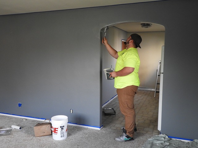
In the kitchen, consider painting the cabinets in bold, contrasting colors to create a striking and contemporary look. Don’t be afraid to experiment with different combinations to find the perfect balance.
In the bedroom, use color blocking to define the sleeping area and create a cozy and relaxing atmosphere.
Tips for Maintaining and Refreshing Your Colorblocked Space
Now that you’ve embraced color blocking in different rooms of your home, it’s important to learn how to maintain and refresh your vibrant and modern space.
When it comes to maintaining your colorblocked space, regular cleaning is key. Dust and dirt can dull the colors, so make sure to dust surfaces and vacuum rugs regularly. If you have painted walls, keep a touch-up paint handy to cover any scuffs or marks.
To refresh your colorblocked space, consider rearranging your furniture or adding new accessories. Switching up the placement of your bold, colorful pieces can give your space a whole new look. You can also introduce new pops of color by adding throw pillows, artwork, or even a colorful rug.

Showcasing Your Colorblocked Space
Now that you’ve created a vibrant and modern colorblocked space, it’s time to showcase your design to friends and family.
You want to highlight the bold and energetic atmosphere you’ve created in your home.
Start by inviting your loved ones over for a gathering or dinner party.
Arrange the seating area strategically, ensuring that your colorblocked zones are visible from different angles.

Use accent pillows and throws in complementary colors to enhance the overall aesthetic.
Consider adding some statement pieces, such as a colorful artwork or a unique light fixture, to draw attention to your design.
Don’t forget to explain the concept behind colorblocking to your guests, so they can appreciate the thought and effort you’ve put into creating this modern and lively space.
Frequently Asked Questions
How do I incorporate color blocking in small spaces?
To incorporate color blocking in small spaces, focus on choosing a limited color palette and using it strategically. Paint one wall a bold color, or use colorful furniture and accessories to create distinct zones.
What are some tips for creating a cohesive color palette throughout my home?
To create a cohesive color palette throughout your home, start by choosing a main color and then select a few complementary colors. Use these colors consistently in different rooms and incorporate them through furniture, accessories, and accents.
Can I use color blocking in more traditional or classic interior design styles?
Yes, you can definitely use color blocking in more traditional or classic interior design styles. It can add a modern and bold touch to your space while still maintaining the elegance and sophistication of traditional design.
How do I choose the right paint finishes for my color blocked walls?
Choose paint finishes for your color blocked walls by considering the desired effect. Matte finishes minimize imperfections, while satin adds a subtle sheen. Glossy finishes create a bold, reflective look. Experiment and choose what suits your style.
Are there any specific color combinations that work best for color blocking?
There aren’t any specific color combinations that work best for color blocking. It’s all about personal preference and creativity. Experiment with different colors and see what works best for your space and aesthetic.
Conclusion
So, you’ve learned all about color blocking and how it can transform your space into a bold and modern interior design.
With a solid understanding of color theory and the right color palette, you can create vibrant zones throughout your home.
By carefully selecting paint colors and considering lighting, you can achieve a harmonious and eye-catching look.
Whether you’re color blocking in the living room, kitchen, or bedroom, remember to maintain and refresh your space as needed.
Showcase your colorblocked space proudly and enjoy the lively and energetic atmosphere it brings to your home.