
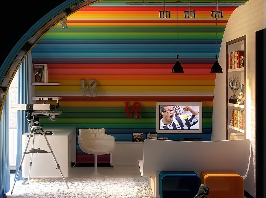
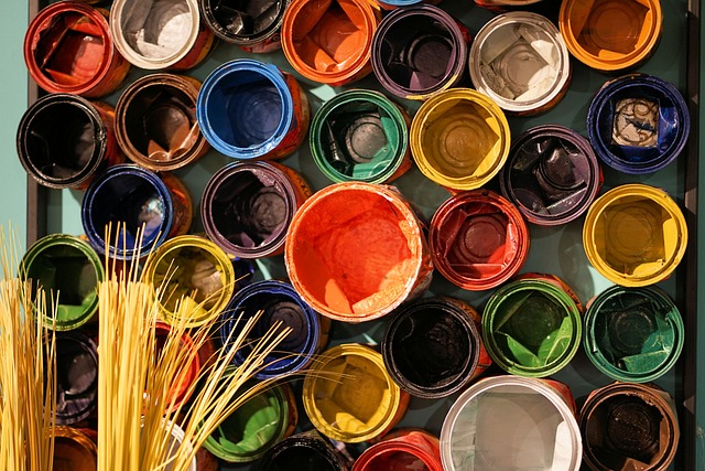
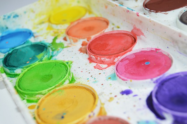
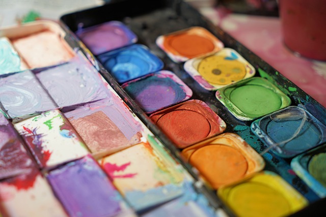
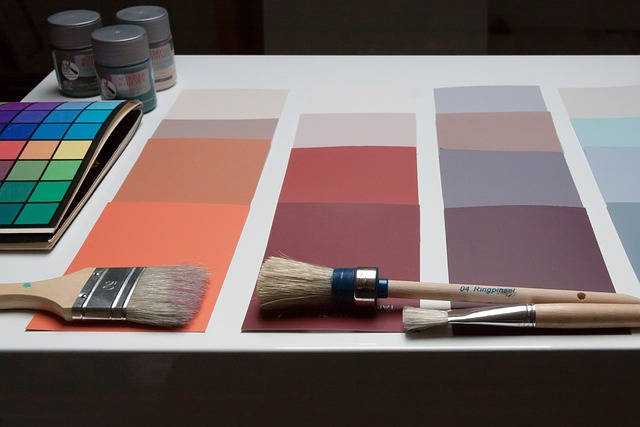
Rainbow Aesthetics For Your Interiors
 How to Artfully Use Multiple Colors in Harmony
Do you want to add a vibrant and playful touch to your interiors?
In ‘Rainbow Aesthetics for Your Interiors: How to Artfully Use Multiple Colors in Harmony,’ we’ll show you how to create a stunning rainbow aesthetic that will bring joy and life to your space.
Discover the psychology behind colors and learn how to choose the right color palette to achieve a harmonious look.
With our tips and tricks, you’ll master the art of layering colors and creating focal points that make a statement.
Get ready to transform your home into a colorful paradise!
Key Takeaways
- Colors evoke specific feelings and emotions
- Select a color palette that creates a cohesive and balanced look
- Layer colors for a statement-making effect
- Create accent walls and focal points with color
The Psychology of Colors: Understanding the Impact on Your Interior Design
To create a harmonious interior design, you should understand the impact of colors on your mood and emotions. Colors have the power to evoke certain feelings and emotions within us. For example, warm colors like red and orange can create a sense of energy and excitement, while cool colors like blue and green can promote a feeling of calmness and relaxation.
Understanding the psychology of colors can help you choose the right color scheme for each room in your home. For instance, if you want your bedroom to be a peaceful sanctuary, you may opt for soothing blues and soft greens. On the other hand, if you want your living room to be a vibrant and energetic space, you may go for bold reds or sunny yellows.
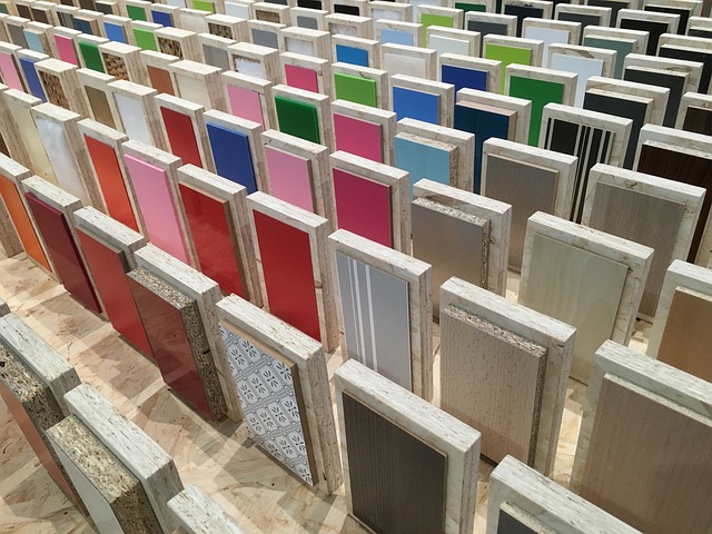
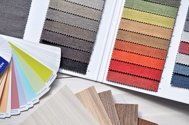
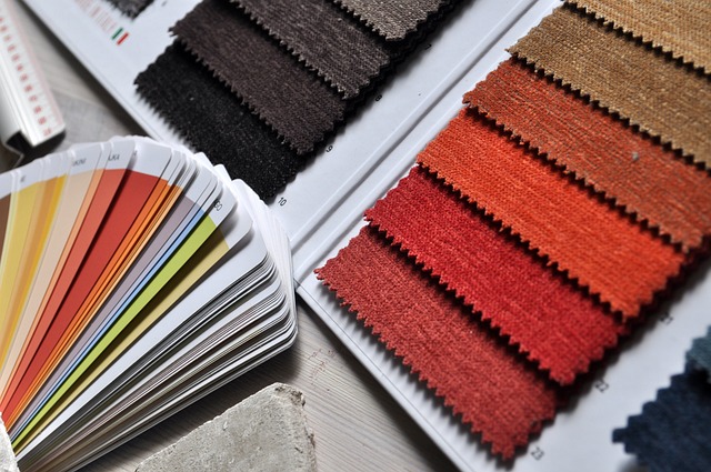
Choosing the Right Color Palette: How to Create a Harmonious Rainbow Aesthetic
Start by selecting a color palette that creates a cohesive and balanced look in your space. When it comes to creating a rainbow aesthetic, it’s important to choose colors that complement each other and create a harmonious vibe. Consider the following table to help you understand how different colors can work together:
| Color | Meaning |
|---|---|
| Red | Passion, energy |
| Orange | Creativity, warmth |
| Yellow | Happiness, optimism |
| Green | Nature, harmony |
| Blue | Calmness, serenity |
| Purple | Royalty, spirituality |
Layering Colors: Tips and Tricks for Mixing Multiple Hues in Your Interiors
When it comes to creating impact with color combinations in your interiors, there are a few key points to keep in mind.
First, you’ll want to choose colors that work harmoniously together to create a visual punch.
Balancing vibrant hues is essential to avoid overwhelming the space, so consider using them as accents rather than the main color scheme.
Lastly, don’t be afraid to play with contrasting tones to add depth and interest to your design.

Color Combinations for Impact
Mixing vibrant colors like red and turquoise can create a striking impact in your interior design. These colors complement each other beautifully, adding a sense of energy and vibrancy to any space.
Imagine painting one accent wall in a bold shade of red and then adding turquoise accessories like throw pillows or curtains. The combination of these two colors will instantly create a focal point in the room and make a bold statement.
Additionally, you can incorporate these colors through artwork or furniture pieces. For example, a red sofa paired with turquoise accent chairs can create a visually stunning seating arrangement.
Don’t be afraid to experiment and play with different color combinations to find the perfect balance for your space.
Balancing Vibrant Hues
To create a harmonious and balanced look with vibrant hues, try incorporating different shades of red and turquoise throughout your space. Red and turquoise are complementary colors that work well together and can add a pop of energy to any room. In the table below, you’ll find a variety of shades in both red and turquoise that you can mix and match to create your desired aesthetic. Whether you choose to use these colors as accents in your furniture, artwork, or accessories, or use them as the main colors for your walls or flooring, the key is to find a balance between the two. By incorporating these vibrant hues in different ways, you can create a visually stimulating and cohesive space.
| Red Shades | Turquoise Shades |
|---|---|
| Crimson | Teal |
| Ruby | Aqua |
| Scarlet | Cyan |
| Burgundy | Turquoise |
| Maroon | Sky Blue |
Using Contrasting Tones
Try incorporating contrasting tones like deep navy and bright yellow to add depth and visual interest to your space.
Start by choosing a dominant color, such as navy, for your walls or larger furniture pieces.
Then, add pops of bright yellow through accent pillows, rugs, or artwork to create a vibrant contrast.
To achieve a harmonious balance, consider adding a neutral element, like a white or cream-colored sofa, to anchor the space. This will prevent the contrasting colors from overwhelming the room.
By using contrasting tones, you can create a dynamic and visually appealing space that is both inviting and stylish.
So go ahead and experiment with different color combinations to make your interiors truly stand out.
Accent Walls and Focal Points: Making a Statement With Color
Creating an accent wall or focal point with a bold color can instantly transform the atmosphere of a room. It adds a pop of personality and draws the eye to a specific area, making a statement. The key is to choose a color that complements the existing color scheme and enhances the overall aesthetic. To help you in your color selection process, here’s a handy table that showcases different color combinations and their effects:
| Color Combination | Effect |
|---|---|
| Blue and White | Calming and fresh |
| Yellow and Gray | Energetic and modern |
| Green and Brown | Earthy and natural |
| Pink and Gold | Glamorous and feminine |
| Orange and Navy | Bold and dynamic |
Use this table as a guide to create an accent wall or focal point that suits your style and elevates your interiors.
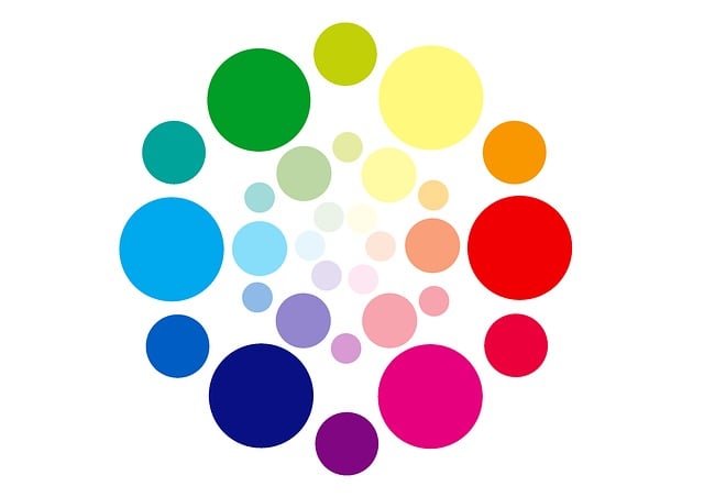
Exploring Different Color Schemes: Monochromatic, Analogous, and Complementary
In this discussion, we’ll explore different color schemes that can create a harmonious and visually appealing interior.
First, let’s delve into the monochromatic color scheme. This involves using varying shades and tones of a single color to create depth and sophistication.
Next, we’ll examine analogous color combinations. These involve using colors that are adjacent on the color wheel to create a cohesive and pleasing palette.
Monochromatic Color Scheme
To achieve a cohesive monochromatic color scheme, start by selecting a dominant shade for your space. This shade will be the foundation upon which you will build the rest of your color palette.
Once you have chosen your dominant shade, you can then explore its various tones and shades to create depth and visual interest. Consider using lighter shades for walls or larger furniture pieces, and darker shades for accents or smaller decor items.
By sticking to shades within the same color family, you create a sense of harmony and unity in the space. Remember to vary the textures and materials you use to add dimension to the room.
With a monochromatic color scheme, you can create a soothing and sophisticated atmosphere that is both visually pleasing and timeless.
Analogous Color Combinations
An analogous color combination can be achieved by selecting colors that are next to each other on the color wheel, such as blue and green or orange and yellow. This color scheme creates a harmonious and visually pleasing effect in your interiors. By using analogous colors, you can create a sense of unity and flow throughout your space. The table below showcases some examples of analogous color combinations and their corresponding emotions:
| Color Combination | Emotion |
|---|---|
| Blue and Green | Calm |
| Orange and Yellow | Energetic |
| Red and Orange | Passionate |
| Yellow and Green | Fresh |
| Purple and Blue | Serene |
Complementary Color Harmonies
By incorporating complementary color combinations, you can create a visually striking and balanced effect in your space. Complementary colors are those that are opposite each other on the color wheel, such as blue and orange or red and green.
Here are four ways you can use complementary color harmonies to enhance your interiors:
- Accentuate focal points: Use a bold and vibrant complementary color on a focal point, such as a statement wall or a piece of furniture, to draw attention and create visual interest.
- Create depth and contrast: Pairing complementary colors in different intensities can add depth and contrast to your space. For example, a pale blue paired with a rich orange can create a dynamic and eye-catching combination.
- Balance warm and cool tones: Complementary colors can help balance warm and cool tones in your space. If you have predominantly warm tones, adding a touch of its complementary cool color can bring a sense of harmony and balance.
- Experiment with different shades: Don’t limit yourself to just primary complementary colors. Explore different shades and hues within the complementary color spectrum to create unique and personalized combinations.
Playing With Patterns: Incorporating Colorful Prints and Textiles in Your Decor
Mixing and matching colorful prints and textiles can add a vibrant and playful touch to your home decor. With a wide range of patterns and colors available, you have the freedom to create a unique and personalized space that reflects your personality.

Start by choosing a color scheme that complements the existing elements in your room. Then, experiment with different prints and textures to create visual interest. Consider incorporating geometric patterns, floral prints, or abstract designs to add depth and dimension to your space.
Don’t be afraid to mix different prints together – the key is to find a common color or theme that ties everything together. Whether it’s through throw pillows, curtains, or rugs, incorporating colorful prints and textiles can instantly transform your home into a lively and inviting sanctuary.
Bold Vs. Subtle: Finding the Balance Between Vibrant and Neutral Colors
Now that you’ve learned how to incorporate colorful prints and textiles into your decor, let’s talk about finding the balance between vibrant and neutral colors. It’s important to strike a harmonious blend of bold and subtle hues to create a visually pleasing space. To help you achieve this, here’s a table highlighting some key points:
| Bold Colors | Subtle Colors |
|---|---|
| Vibrant and attention-grabbing | Soothing and calming |
| Can be used as statement pieces | Ideal for creating a backdrop |
| Use in moderation to avoid overwhelming the space | Add pops of color through accessories |
| Pair with neutral tones to create a balanced look | Can be layered to add depth |
Lighting and Color: How Illumination Can Enhance or Diminish Your Rainbow Aesthetic
When it comes to creating a vibrant rainbow aesthetic in your interiors, lighting plays a crucial role as a color enhancer. By strategically placing different light sources, you can enhance the hues in your space and bring out their true vibrancy.
However, it’s important to find the right balance between illumination and the colors you’ve chosen, as too much or too little light can diminish the impact of your rainbow aesthetic. Additionally, the dimming effects of lighting can greatly influence the overall aesthetics, creating a more subtle or dramatic ambiance depending on your preferences.
Lighting as Color Enhancer
Using colored light bulbs can create a vibrant and harmonious atmosphere in your home. By strategically placing different colored bulbs throughout your space, you can enhance the overall aesthetic and mood.
For example, placing a blue light bulb in your bedroom can create a calm and relaxing ambiance, perfect for winding down at the end of the day. In your living room, a combination of red and yellow bulbs can create a warm and inviting atmosphere, ideal for entertaining guests.
Additionally, using colored light bulbs can also highlight specific areas or objects in your home. For instance, a green light bulb placed above a houseplant can draw attention to its lush foliage, making it a focal point in the room.
Overall, incorporating colored light bulbs into your home decor can add depth and character to your space, creating a visually pleasing and enjoyable environment.
Balancing Illumination and Hues
By strategically placing different colored light bulbs throughout your space, you can achieve a harmonious balance between illumination and hues. This allows you to create a visually stunning environment that is both inviting and vibrant. To help you understand the impact of different colored light bulbs, here is a table showcasing the emotions and moods associated with each color:
| Color | Emotion | Mood |
|---|---|---|
| Red | Passion | Excitement |
| Blue | Calmness | Serenity |
| Green | Harmony | Balance |
| Yellow | Happiness | Cheerfulness |
Using this table as a guide, you can select the appropriate colored light bulbs to enhance the desired atmosphere in each specific area of your space. For example, you might choose red lighting in your entertainment area to create a sense of excitement, or blue lighting in your bedroom to promote relaxation. Remember, the key is to find the perfect balance between illumination and hues to create a visually appealing and emotionally uplifting space.
Dimming Effects on Aesthetics
To create a more relaxed and intimate ambiance, you can dim the lights in your space. By reducing the brightness, you can add a touch of coziness and warmth to any room.
Dimming the lights not only enhances the overall aesthetic but also allows you to create different moods depending on the occasion. Whether you’re having a romantic dinner or hosting a movie night, adjusting the lighting can make a significant difference.
With a dimmer switch or the use of dimmable light bulbs, you have the power to create a soft and inviting atmosphere. Experiment with different levels of brightness to find the perfect balance that complements your rainbow aesthetics.
So go ahead, dim the lights, and let the colors of your space shine in a whole new light.
The Art of Color Blocking: Creating Visual Interest With Strategic Color Placement
Want to add visual interest to your interiors?
Master the art of color blocking by strategically placing different hues in your space. Color blocking is a technique that involves using contrasting or complementary colors to create bold and eye-catching designs.
Start by selecting a color palette that reflects your personal style and the mood you want to create in your space. Then, divide your room into different color zones and use paint, wallpaper, or furniture to define each area.
For example, you can paint one wall in a vibrant shade and pair it with neutral furniture to make it pop. Or, create a focal point by using a bold, contrasting color on a piece of furniture or an accent wall.
The key is to experiment with different combinations and placements to find what works best for your space. So go ahead, unleash your creativity and transform your interiors with the power of color blocking.
Seasonal Color Palettes: Refreshing Your Interiors With the Changing Tides of Nature
Refresh your living space by incorporating seasonal color palettes inspired by the changing tides of nature. Create a harmonious atmosphere that reflects the beauty of each season and brings a sense of freshness to your interiors. By incorporating colors that are reminiscent of nature’s transitions, you can transform your space into a serene retreat.
To help you get started, here’s a table showcasing three seasonal color palettes:
| Season | Dominant Color | Complementary Colors |
|---|---|---|
| Spring | Soft pastels | Light greens, pinks |
| Summer | Vibrant blues | Sunny yellows, whites |
| Autumn | Warm earth tones | Deep oranges, browns |
These color palettes capture the essence of each season, allowing you to infuse your space with the feeling of spring blossoms, summer skies, or autumn foliage. So go ahead, embrace the changing tides of nature and bring a touch of seasonal beauty into your home.
Frequently Asked Questions
What Are Some Common Psychological Effects of Different Colors on Interior Design?
Different colors have varying psychological effects on interior design. For example, blue can create a calming atmosphere, while red can evoke energy and passion. So, consider these effects when using multiple colors in your space.
How Do I Choose the Right Color Palette for a Rainbow Aesthetic?
To choose the right color palette for a rainbow aesthetic, consider your personal preferences and the mood you want to create. Experiment with different combinations and shades, and trust your instincts to create a harmonious and visually appealing space.
Can You Provide Tips on How to Effectively Layer Multiple Colors in My Interiors?
Sure! To effectively layer multiple colors in your interiors, start by selecting a dominant color scheme and then add accent colors in smaller doses. Use color-blocking techniques, mix patterns, and play with textures to create a harmonious and visually appealing space.
How Can I Create an Accent Wall or Focal Point Using Color?
To create an accent wall or focal point using color, start by choosing a bold hue that complements your overall color scheme. Paint one wall in that color, or use wallpaper, and add contrasting elements like artwork or furniture to make it stand out.
What Are Some Popular Color Schemes for Creating a Rainbow Aesthetic?
To create a rainbow aesthetic, popular color schemes include complementary colors, such as blue and orange, or analogous colors, like green and yellow. These combinations bring vibrancy and harmony to your interiors.
Conclusion
So there you have it, creating a rainbow aesthetic in your interiors is all about understanding the psychology of colors, choosing the right color palette, and artfully layering multiple hues.
Whether you prefer bold and vibrant or subtle and neutral, finding the right balance is key. Don’t forget to consider lighting and strategic color placement to enhance the overall effect.
And why not refresh your interiors with seasonal color palettes to keep things interesting? So go ahead, unleash your creativity and create a harmonious rainbow aesthetic that reflects your unique style and personality.