
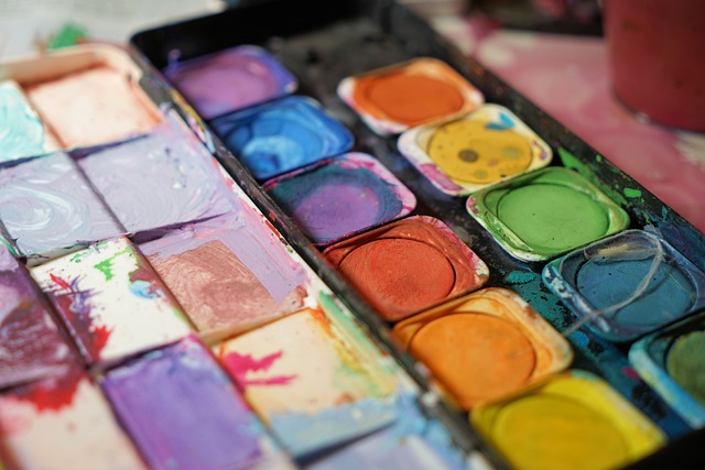
The Psychology Of Colors

How Hues Impact Emotions
Are you curious about how colors can influence your emotions in interior design? Discover the psychology behind hues and their impact on your mood.
Warm colors have the power to energize and invigorate, while cool colors create a sense of calm and relaxation.
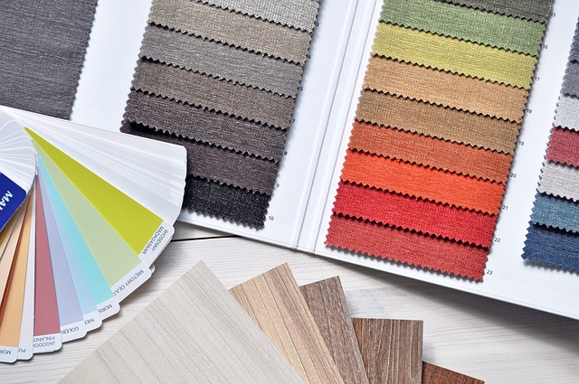
Neutral tones provide a versatile backdrop, while contrast and complementary colors add visual interest.
Explore how light and dark shades affect the atmosphere, and learn how to use colors to define spaces.
Don’t be afraid to experiment and find your personal preferences in color psychology.
Key Takeaways
- Creating distinct zones and incorporating different color schemes enhances functionality and organization in interior design.
- Choosing specific colors for each zone and creating a coherent color palette helps to evoke desired mood and ambiance in different areas.
- Considering the emotions each hue evokes and experimenting with color psychology can create a cohesive and mood-enhancing color scheme.
- Personal preference plays a crucial role in color selection, and it is important to find the perfect balance that suits individual style and tastes.
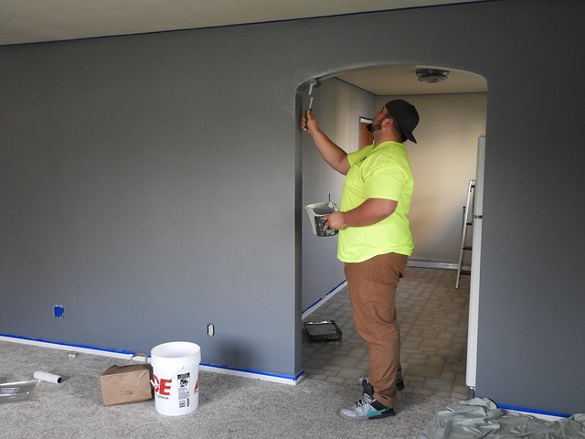
The Power of Warm Colors
Warm colors like red and orange can create a cozy and inviting atmosphere in a room. When you walk into a space adorned with these hues, you immediately feel a sense of warmth and comfort.
The vibrant shades of red stimulate energy and passion, while the soothing tones of orange promote a welcoming and friendly ambiance. These warm colors have the power to make a room feel more intimate and intimate, making it an ideal choice for living rooms and bedrooms.
The warmth they exude can also evoke feelings of happiness and excitement, making them perfect for social areas or spaces where you want to encourage interaction.
The Calming Effect of Cool Colors
Cool colors like blue and green have a calming effect on our minds and bodies. When you enter a room painted in these hues, you instantly feel a sense of tranquility wash over you.
The soft blue walls create a serene atmosphere, allowing you to relax and unwind after a long day. The gentle green of the furniture and decor adds to the soothing ambiance, creating a space that promotes peace and harmony.
As you sit in this cool-colored room, you can feel your stress melting away, your heart rate slowing down, and your mind becoming more clear and focused. The cool colors create a sense of balance and stability, providing a much-needed escape from the chaos of the outside world.
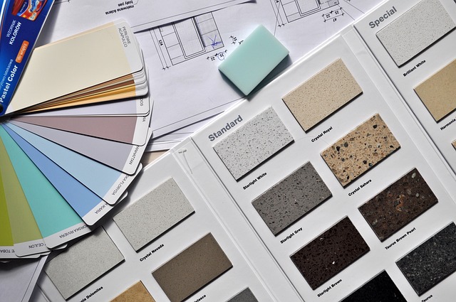
The Neutral Tones
The neutral tones of beige and gray create a sense of calm and balance in a room. When you walk into a space adorned with these hues, you instantly feel a wave of serenity wash over you.
The soft, muted tones of beige evoke a feeling of warmth and comfort, while the coolness of gray adds a touch of sophistication and elegance. Together, they create a harmonious atmosphere that promotes relaxation and tranquility.
The simplicity of these colors allows other elements in the room to shine, be it furniture, artwork, or accessories. The neutral tones act as a backdrop, allowing you to focus on the things that truly matter to you.
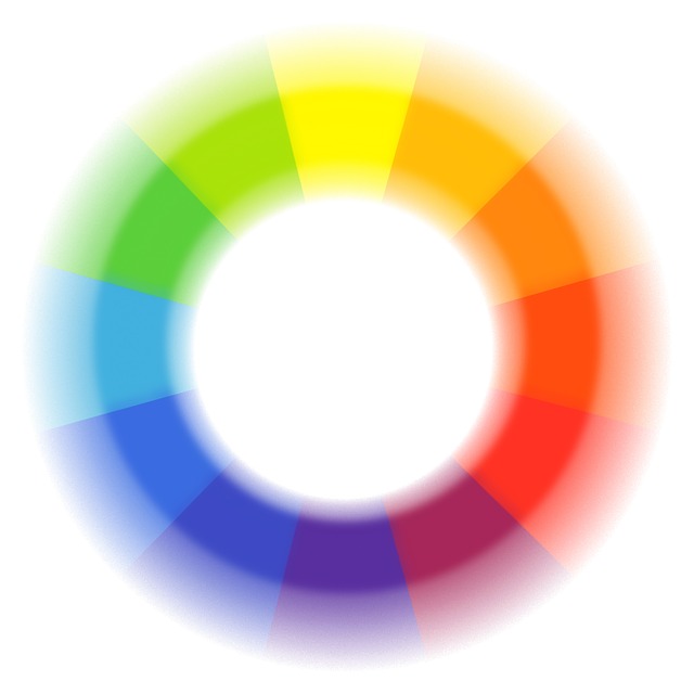
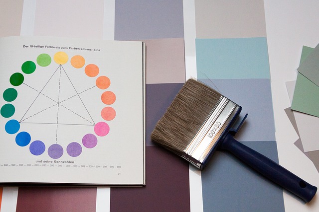
Using Contrast and Complementary Colors
When it comes to creating drama in your interior design, contrasting colors are your best tool. By pairing colors that are opposites on the color wheel, such as black and white or blue and orange, you can instantly add visual interest and excitement to any space.
On the other hand, achieving balance in your design can be accomplished through the use of complementary colors. These are colors that are located opposite each other on the color wheel and when used together, they create a harmonious and balanced look.
Creating Drama with Contrasting Colors
To create drama with contrasting colors, you can experiment with bold and vibrant hues to evoke strong emotions in your space. Here’s how you can achieve this effect:
- Choose complementary colors: By pairing opposites on the color wheel, such as blue and orange or red and green, you can create a striking contrast that catches the eye and adds excitement to your room.
- Use high contrast accents: Incorporate pops of color in unexpected places, like a bright red chair against a neutral backdrop or a bold yellow rug in a predominantly blue room. These accents will draw attention and create a sense of drama.
- Mix patterns and textures: Combine different patterns and textures in contrasting colors to create visual interest. For example, you can pair a geometric patterned wallpaper with a plush velvet sofa in a vibrant color. This mix will add depth and drama to your space.
Achieving Balance with Complementary Colors
Achieving balance with complementary colors can create a visually harmonious and cohesive space. When you pair colors that are opposite each other on the color wheel, such as blue and orange or red and green, you create a dynamic and energetic atmosphere. Complementary colors bring out the best in each other and create a sense of harmony.
For instance, if you have a predominantly blue room, adding touches of orange will provide a striking contrast and make the space feel more balanced. Complementary colors also have the ability to create a focal point and draw attention to specific areas or objects in a room.
The Impact of Light and Dark Shades
The impact of light and dark shades on emotions can be seen in the way different colors affect mood. When it comes to interior design, the use of light and dark shades can greatly influence how a space makes you feel. Here’s why:
- Light shades, such as pastels and neutrals, create a sense of calmness and tranquility. They can make a room feel more spacious and airy.
- Dark shades, like deep blues and blacks, evoke a sense of mystery and intimacy. They can make a room feel cozy and cocoon-like.
- Light and dark shades used together can create contrast and visual interest in a space. It adds depth and dimension to the overall design.
- The ratio of light to dark shades can also affect the overall mood. More light shades can create a brighter and uplifting atmosphere, while more dark shades can create a moody and dramatic ambiance.
Cultural and Personal Associations with Colors
When it comes to choosing colors for your space, consider the cultural and personal associations different shades can have.

Colors have the power to evoke specific emotions and meanings, both on a societal level and an individual level.
For example, in Western cultures, red is often associated with passion and energy, while in Asian cultures, it represents luck and prosperity.
Similarly, blue is commonly linked to calmness and tranquility in many cultures, but it can also symbolize sadness or depression in some contexts.
It is important to take into account your own personal experiences and preferences as well.
Maybe a certain shade of green reminds you of a peaceful childhood memory, or a vibrant yellow brings a sense of joy to your heart.
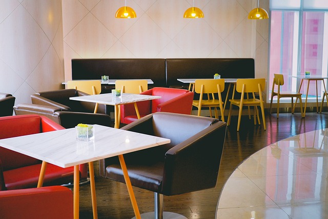
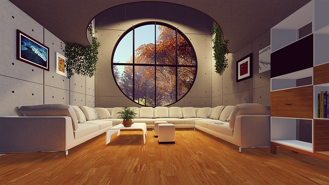
Incorporating Colors in Different Rooms
Incorporate colors that reflect your desired mood and personality into each room of your home.
Start with the living room, where you can use warm tones like red or orange to create an inviting and energetic atmosphere.
For the bedroom, choose calming colors like blue or green to promote relaxation and better sleep.
In your office or workspace, opt for colors like yellow or purple to inspire creativity and focus.
The kitchen can benefit from bright and lively colors like yellow or green to stimulate appetite and create a cheerful ambiance.
Finally, in the bathroom, consider using cool tones like light blue or pastel shades to create a spa-like retreat.
The Role of Accent Colors
Using accent colors can add depth and visual interest to any room in your home. Accent colors are vibrant hues that are strategically placed to create emphasis and highlight specific features or areas in a space.
By incorporating accent colors, you can instantly transform a room and make it more visually appealing. For example, adding a pop of bright yellow in a neutral-toned living room can create a focal point and inject energy into the space. Similarly, using a bold red hue on a single wall in your bedroom can create a sense of warmth and coziness.
Accent colors can also be used to tie different elements together, such as using the same color for throw pillows, artwork, and accessories. So don’t be afraid to experiment with accent colors and let your personality shine through in your home decor.
Using Colors to Define Spaces
When it comes to open concept designs, color psychology plays a crucial role in defining different zones within a space. By using different color schemes, you can create distinct areas that serve specific purposes and evoke desired emotions.
Whether you want to create a cozy reading nook or a vibrant entertaining area, understanding how colors impact our emotions can help you design a space that feels both cohesive and functional.
Color Psychology in Open Concept Designs
The use of warm colors in open concept designs creates a cozy and inviting atmosphere. When you incorporate warm hues like reds, oranges, and yellows into your open concept space, you instantly make it feel more welcoming and comfortable.
These colors have a psychological effect on our emotions, evoking feelings of warmth, happiness, and relaxation. They can also help to visually define different areas within the open space, allowing you to create distinct zones for dining, lounging, and entertaining.
Creating Zones with Different Color Schemes
Incorporating different color schemes allows for the creation of distinct zones within an open concept space. By choosing specific colors for each zone, you can visually separate areas and give them their own unique identity.
For example, using warm, earthy tones like beige and brown in the living room area can create a cozy and inviting atmosphere for relaxation and conversation.
On the other hand, using cool, refreshing colors like blue and green in the dining area can enhance appetite and promote a sense of freshness.
Creating a Coherent Color Palette
To create a coherent color palette, you should consider the emotions each hue evokes. Colors have a profound impact on our mood and can greatly influence the atmosphere of a space. By understanding the psychology of colors, you can strategically choose hues that will create the desired ambiance in your interior design. Here is a table that outlines the emotions commonly associated with different colors:
| Color | Emotion |
|---|---|
| Red | Passion, Energy |
| Blue | Calmness, Serenity |
| Yellow | Happiness, Optimism |
| Green | Renewal, Harmony |
When selecting colors for your palette, think about the emotions you want to evoke in each room. For example, if you want a peaceful bedroom, you might opt for shades of blue. On the other hand, if you want a vibrant and energetic living room, red or yellow tones could be a good choice. By considering the emotional impact of each color, you can create a cohesive and mood-enhancing color scheme in your home.
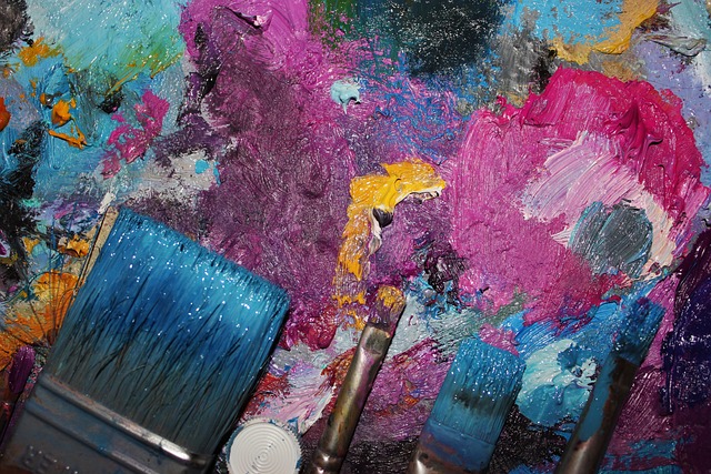
Experimenting with Color Psychology
When experimenting with color psychology, it’s important to consider the emotions that different hues can evoke. By understanding the impact of colors on our emotions, you can create an atmosphere that aligns with your desired mood.
Here are three key emotions that different colors can evoke:
- Red: This vibrant hue is known to stimulate energy and passion. It can create a sense of excitement and urgency, making it perfect for spaces where you want to encourage action or create a focal point.
- Blue: Often associated with calmness and tranquility, blue is a soothing color that can promote relaxation. It’s ideal for bedrooms and spaces where you want to create a serene atmosphere.
- Yellow: This cheerful color evokes feelings of happiness and optimism. It can brighten up any room and create a sense of warmth and positivity.
The Importance of Personal Preference and Experimentation
Understanding your personal preference and experimenting with different shades can help you create a space that truly reflects your unique style and tastes.
When it comes to interior design, color plays a crucial role in setting the mood and atmosphere of a room. The colors you choose can evoke various emotions and impact your overall well-being.
By considering your personal preference, you can select colors that resonate with you on a deeper level. Whether you prefer calming blues, energizing yellows, or sophisticated neutrals, your personal preference should guide your color choices.
Experimenting with different shades allows you to find the perfect balance that suits your personality and desired ambiance. So, don’t be afraid to step out of your comfort zone and explore the vast world of colors to create a space that truly represents you.
Frequently Asked Questions
What are some common misconceptions about the psychology of colors in interior design?
Some common misconceptions about the psychology of colors in interior design include thinking that all colors have the same impact on emotions and assuming that color preferences are universal.
How do different colors affect productivity and concentration in a workspace?
Different colors have different effects on productivity and concentration in a workspace. For example, blue can increase focus and efficiency, while green promotes a sense of calm and balance.
Are there any specific colors that can help promote relaxation and better sleep in a bedroom?
To promote relaxation and better sleep in your bedroom, opt for soothing colors like light blue, lavender, or soft gray. These colors have a calming effect on the mind and can help create a peaceful environment conducive to restful sleep.
Can the use of certain colors in interior design have a positive or negative impact on mental health?
Certain colors in interior design can have a positive or negative impact on mental health. For example, warm colors like yellow and orange can promote happiness and energy, while cool colors like blue and green can induce calmness and relaxation.
Are there any cultural differences in the perception and use of colors in interior design?
Yes, there are cultural differences in the perception and use of colors in interior design. Different cultures have unique associations and meanings for colors, which can influence their use and impact on emotions.
Conclusion
In conclusion, the psychology of colors in interior design is a powerful tool to create the desired emotional impact in your space.
By understanding the effects of warm, cool, neutral, and contrasting colors, you can create a harmonious and inviting atmosphere.
Don’t be afraid to experiment with different color palettes and trust your personal preferences.
Whether you want to create a calming oasis or an energizing space, the right colors can make all the difference.
So go ahead and have fun with colors to transform your interior design!