
Using The 60-30-10 Rule

Perfect Proportions For Color Harmony
Are you struggling to find the perfect color combination for your interior design? Look no further!
In this article, we will show you how to achieve color harmony using the 60-30-10 rule. You’ll learn the basics of color theory, understand the rule’s proportions, and discover how to select a dominant color that suits your space.
We’ll even delve into the psychology behind colors and how they can enhance the mood of your room.
So, let’s get started and bring your design to life!
Key Takeaways
- The 60-30-10 rule is a guideline for achieving color harmony in interior design by allocating 60% of the space to a dominant color, 30% to a secondary color, and 10% to accent colors.
- Following this rule helps in selecting and balancing colors effectively, providing a guideline for proportionate color distribution and creating a harmonious and well-designed space.
- Consider the mood and atmosphere desired for each space, as different color combinations evoke different emotions. Reflect on the desired mood and ambiance, and choose colors that complement each other and the overall design.
- Color harmony creates a sense of balance and unity, enhancing the overall aesthetic of the interior design. It adds visual interest and dimension to the space, allowing for creativity and personal expression, and can create a unique and eclectic design style.
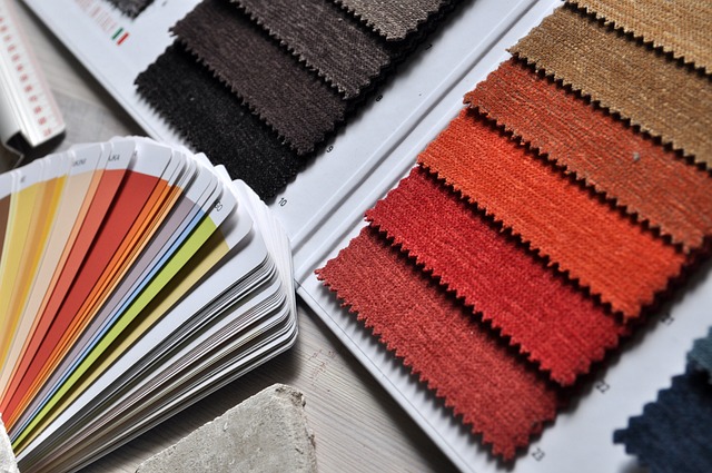
Understanding the Basics of Color Theory
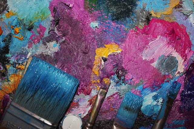
Understanding the basics of color theory is essential for achieving harmonious color combinations in interior design. When you grasp the fundamentals of color theory, you can create a visually pleasing space that evokes the desired emotions and mood.
One fundamental principle is the color wheel, which consists of primary, secondary, and tertiary colors. By understanding how colors relate to one another, you can create a balanced and cohesive color palette.
Another important aspect is color temperature, which refers to the warmth or coolness of a color. Warm colors like red and yellow can create an inviting and cozy atmosphere, while cool colors like blue and green can promote a sense of calmness and serenity.
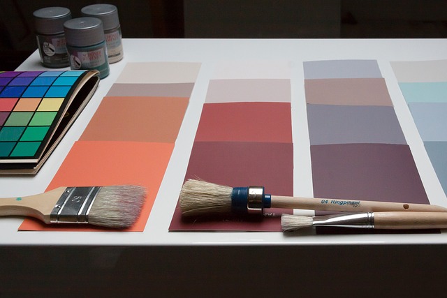
The 60-30-10 Rule Explained
Explaining the 60-30-10 rule in interior design is essential for achieving a harmonious color scheme.
This rule helps you create a balanced and visually pleasing space by dividing your color choices into three main components.
The first component, which should make up 60% of your color scheme, is the dominant color. This color sets the tone for the room and should be used on larger surfaces like walls or furniture.
The second component, comprising 30% of the scheme, is the secondary color. This color adds depth and interest and can be used on items like curtains or accent chairs.
Finally, the remaining 10% is allocated to the accent color. This color adds pops of interest and can be used on smaller items like throw pillows or artwork.
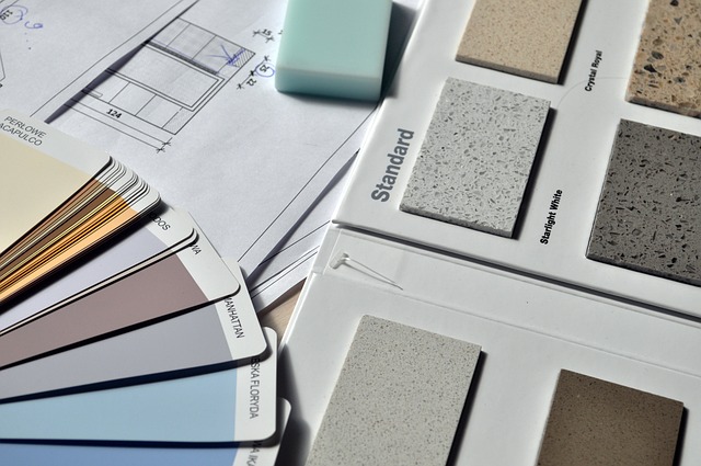
Choosing a Dominant Color for Your Space
When selecting the dominant color for your space, it’s important to consider the overall mood and atmosphere you want to create. The dominant color will set the tone for the entire room and influence the way you feel when you enter it. To help you make an informed decision, here is a table showcasing the psychological effects of different colors:
| Color | Psychological Effect |
|---|---|
| Blue | Calming and serene |
| Red | Energetic and bold |
| Green | Refreshing and soothing |
| Yellow | Optimistic and uplifting |
| Purple | Creative and luxurious |
Selecting a Secondary Color to Complement the Dominant Color
To create a cohesive and balanced color scheme, it’s crucial to select a secondary color that complements the dominant color. This secondary color serves as a supporting element, enhancing the overall aesthetic of your space.
When choosing this color, consider the dominant color’s undertones and choose a secondary color that harmonizes with them. For example, if your dominant color has warm undertones, opt for a secondary color that also has warm undertones to create a harmonious and inviting atmosphere. On the other hand, if your dominant color has cool undertones, select a secondary color with cool undertones for a calming and serene effect.
Adding Accents with the 10% Color
Don’t forget to add accents with the 10% color to bring visual interest and depth to your space.

The 10% color is a small but powerful element that can make a big impact on your interior design.
Whether it’s through throw pillows, artwork, or even a statement piece of furniture, incorporating accents in the 10% color can add personality and vibrancy to your room.
This color should be used sparingly to create a focal point or to tie the whole design together.
By strategically placing accents in the 10% color throughout your space, you can create a cohesive and visually appealing look.
Using Different Shades and Tones for Variation
You can create visual interest and depth in your space by incorporating different shades and tones for variation. Using a variety of shades and tones within the same color family can add dimension and create a sense of balance in your room. For example, in a living room, you can use different shades of blue for the walls, furniture, and accessories to create a cohesive and visually appealing space.
To illustrate this concept further, here is a table showcasing different shades of blue that can be used together:
| Light Blue | Medium Blue | Dark Blue |
|---|---|---|
| Sky Blue | Teal Blue | Navy Blue |
| Baby Blue | Turquoise | Cobalt |
| Powder Blue | Cerulean | Indigo |
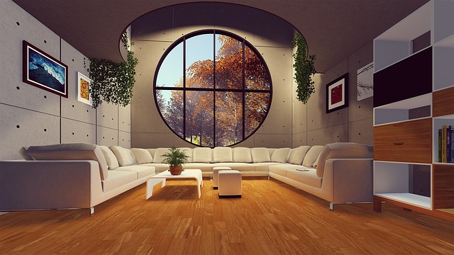
Applying the Rule to Different Rooms in Your Home
Applying this concept to various rooms in your home can create a cohesive and visually appealing design.
In your living room, you can use the 60-30-10 rule to select the main color for the walls, the secondary color for the furniture and accents, and the accent color for smaller details like throw pillows or artwork. This creates a balanced and harmonious color scheme that will make your living room feel inviting and put-together.

In the kitchen, you can apply the rule by choosing a dominant color for the cabinets and countertops, a secondary color for the backsplash or walls, and an accent color for accessories like dishware or curtains. This will create a well-coordinated and stylish kitchen that you’ll love spending time in.
Experimenting with Different Color Combinations
Experimenting with different color combinations can lead to unique and eye-catching aesthetics throughout your home. The possibilities are endless when it comes to mixing and matching colors to create a personalized and visually appealing space.
By trying out various color palettes, you can discover which combinations work best for each room and achieve the desired atmosphere. For example, pairing warm, earthy tones with vibrant pops of color can create a cozy and inviting living room, while using cool, calming shades in the bedroom can promote relaxation and restful sleep.
Don’t be afraid to step out of your comfort zone and play with bold and unexpected color choices. You might be surprised by the stunning results and the impact it can have on your overall home decor.
So go ahead, get creative, and let your imagination run wild with color!
Using Color Psychology to Enhance the Mood of Your Space
To enhance the mood of your space, consider incorporating colors that evoke specific emotions and feelings. Here are four color choices that can help create the desired atmosphere:
- Blue: This calming color promotes relaxation and tranquility, making it an excellent choice for bedrooms or spaces where you want to unwind after a long day.
- Yellow: A vibrant and energetic color, yellow can bring warmth and positivity to any room. It is often associated with happiness and creativity, making it a great option for home offices or areas where you want to feel inspired.
- Green: Symbolizing nature and growth, green can create a sense of harmony and balance. It is ideal for spaces where you want to promote a feeling of freshness and rejuvenation, such as bathrooms or living rooms.
- Red: A bold and passionate color, red can evoke strong emotions and create a sense of excitement. It is perfect for spaces where you want to create a lively and energetic atmosphere, like dining rooms or entertainment areas.
Balancing Bold and Neutral Colors
To balance bold and neutral colors in your space, consider using pops of vibrant shades alongside more subdued tones for a visually appealing and harmonious design.
Incorporating vibrant colors like red, yellow, or blue in small doses can add energy and personality to an otherwise neutral space. Think about using these bold hues in accent pieces such as pillows, artwork, or even a statement piece of furniture. By doing so, you create a focal point that draws the eye and adds visual interest to the room.

Pair these vibrant shades with more neutral tones like white, beige, or gray to create balance and prevent the space from feeling overwhelming. This combination of bold and neutral colors will create a dynamic and inviting atmosphere in your home.
Incorporating Texture and Patterns to Enhance the Color Scheme
Incorporating texture and patterns can add depth and visual interest to your color scheme, creating a dynamic and inviting atmosphere in your home. Here are three ways you can enhance your color scheme with textures and patterns:
- Mix different textures: Experiment with a combination of smooth, rough, soft, and shiny surfaces. For example, pair a plush velvet sofa with a sleek glass coffee table to create a luxurious and modern look.
- Layer patterns: Don’t be afraid to mix and match different patterns in your space. Combine floral prints with geometric designs or stripes with polka dots. Just make sure to keep a common color palette to maintain cohesion.
- Add textural elements: Incorporate elements like woven baskets, textured wall hangings, or faux fur throws to bring in tactile interest. These elements not only add texture but also create a cozy and inviting atmosphere.
Finalizing Your Color Palette and Bringing Your Design to Life
Now that you’ve learned how to incorporate texture and patterns to enhance your color scheme, it’s time to finalize your color palette and bring your design to life.
The 60-30-10 rule can be a helpful guide in achieving color harmony in your interior design. Start by selecting a dominant color that will cover 60% of the space, such as the wall color.
Next, choose a secondary color that will make up 30% of the design, like the furniture or curtains.
Finally, add pops of accent color, making up the remaining 10%, through accessories and decor.
By following this rule, you can create a cohesive and visually pleasing color palette.
Remember to consider the mood and atmosphere you want to create in each space, as different color combinations can evoke different emotions.
Frequently Asked Questions
How can I incorporate the 60-30-10 rule in a small space?
Incorporate the 60-30-10 rule in a small space by choosing three colors: use the dominant color on 60% of the walls, furniture, or flooring; the secondary color on 30% of the accents; and the accent color on 10% of the accessories or decor.
Can I use more than three colors in my color scheme?
Yes, you can use more than three colors in your color scheme. While the 60-30-10 rule provides a guideline for balance, it doesn’t limit you to only three colors. Just ensure that the additional colors complement each other well.
Should I consider the lighting in my space when choosing colors?
Consider the lighting in your space when choosing colors. It can greatly affect how colors appear and create a different atmosphere. Be mindful of natural light, artificial lighting, and how they interact with your chosen color scheme.
How do I choose a color that will stand out as the dominant color?
Choose a color that stands out as the dominant color by selecting a shade that contrasts with the surrounding colors. Make sure it is a bold and vibrant hue that grabs attention and adds visual interest to the space.
Is it necessary to follow the 60-30-10 rule exactly, or can I make slight adjustments to the proportions?
Yes, you can make slight adjustments to the proportions of the 60-30-10 rule. It is not necessary to follow it exactly, as long as you maintain a good balance of colors in your interior design.
Conclusion
So there you have it! By following the 60-30-10 rule, you can achieve perfect proportions for color harmony in your interior design.
Remember to choose a dominant color, complement it with a secondary color, and add accents with the 10% color.
Consider using color psychology to enhance the mood of your space and balance bold and neutral colors.
Don’t forget to incorporate texture and patterns to enhance your color scheme.
With a finalized color palette, you’re ready to bring your design to life!
Happy decorating!