
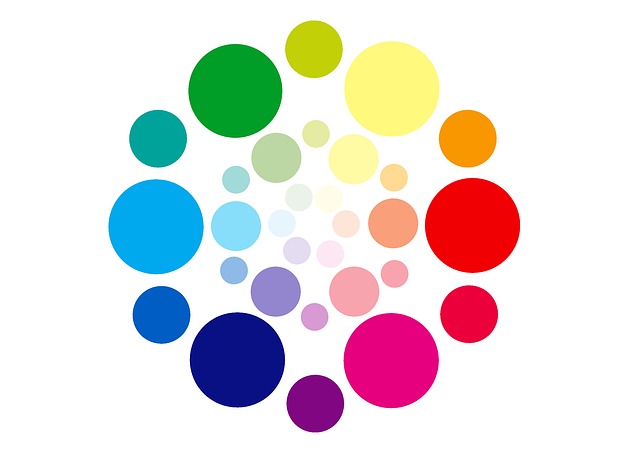
Analogous Color Harmony

Harmonizing Neighboring Hues For Cohesive Interiors
Are you looking to create a cohesive and visually pleasing interior space? Look no further than the concept of analogous color harmony.
By harmonizing neighboring hues, you can achieve a seamless and balanced look that ties your entire home together.
In this article, we will guide you through the process of understanding and choosing your color palette, exploring different analogous color schemes, and applying them to your walls and furniture.
Get ready to transform your living space into a harmonious haven that reflects your personal style.
Key Takeaways
- Choosing colors that complement each other creates a seamless transition between rooms.
- Using analogous color schemes for neighboring rooms creates a cohesive and unified look.
- Creating a visual connection between spaces helps to tie rooms together.
- Incorporating accent colors throughout different rooms creates a harmonious flow in the home.
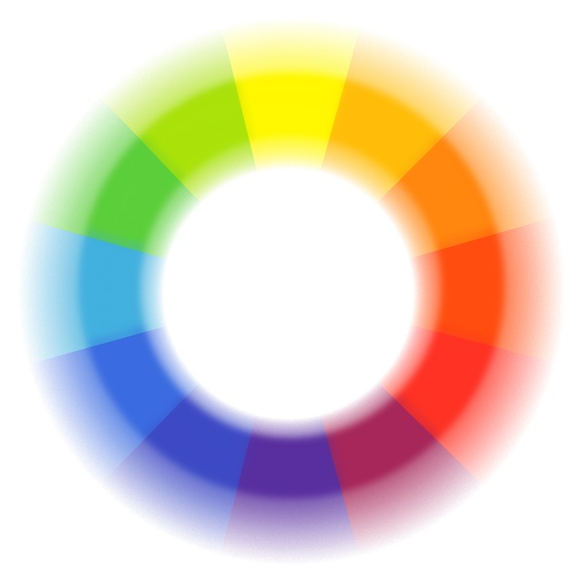
Understanding Analogous Colors
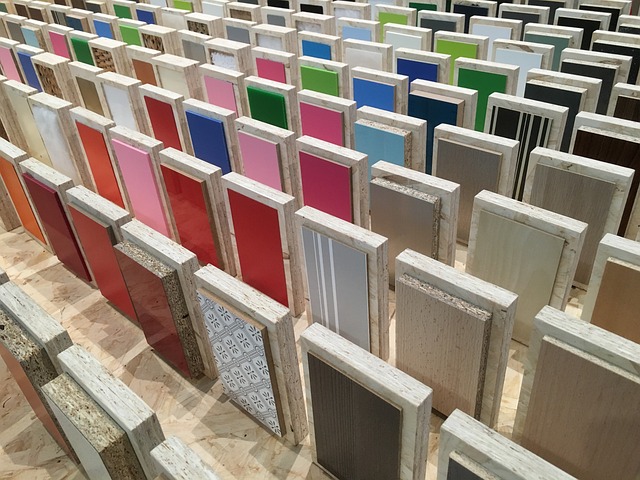
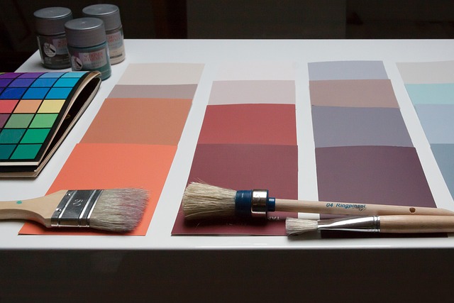
To understand analogous colors, you need to know that they are colors that sit next to each other on the color wheel and create a harmonious and cohesive look in your interiors. When you choose analogous colors for your space, you are selecting hues that are similar in tone and share a common color family.
For example, you might choose a combination of blues and greens, or yellows and oranges. The beauty of analogous colors is that they naturally blend together, creating a sense of balance and tranquility in your space. This color scheme is perfect for creating a soothing and relaxing atmosphere, making it an ideal choice for bedrooms, living rooms, and other areas where you want to unwind.
Choosing Your Color Palette
When choosing your color palette, it’s important to start by selecting a dominant color that will set the tone for your space. This color will be the main focus and will influence the overall mood of the room.
Once you have your dominant color, you can then identify the neighboring hues that will harmonize with it, creating a cohesive and visually pleasing interior.

Selecting a Dominant Color
Start by choosing a dominant color that will serve as the foundation for your cohesive interior design. This color will set the tone for the entire space and help create a sense of harmony and balance.
Consider selecting a color that you’re drawn to and that reflects your personal style and preferences. Once you’ve chosen your dominant color, you can then build upon it by selecting neighboring hues that harmonize well together.
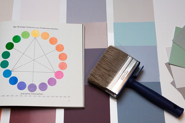
Analogous colors, which are located next to each other on the color wheel, work particularly well for creating a cohesive look. By using colors that are closely related, you can achieve a seamless flow throughout your space, making it feel inviting and visually pleasing.
Keep in mind that while the dominant color will be the main focus, the neighboring hues will add depth and interest to your overall design.
Identifying Neighboring Hues for Harmonization
Once you’ve chosen your dominant color, you can easily identify neighboring hues that will complement and enhance your overall design. By selecting analogous colors, which are hues that are adjacent to your dominant color on the color wheel, you can create a harmonious and cohesive interior. Analogous color schemes are pleasing to the eye and can create a sense of unity in your space. To help you better understand how to identify and use neighboring hues, here is a table that showcases some examples:
| Dominant Color | Neighboring Hues |
|---|---|
| Blue | Green, Purple |
| Yellow | Orange, Green |
| Red | Orange, Purple |
| Green | Yellow, Blue |
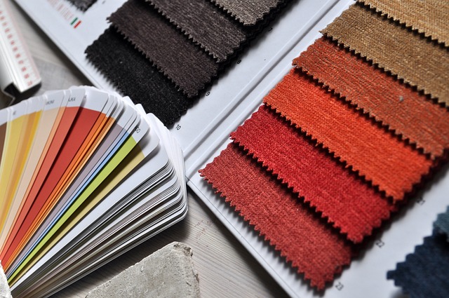
Exploring Different Analogous Color Schemes
To explore different analogous color schemes, you can experiment with combining neighboring hues for a cohesive and visually pleasing interior design. By selecting colors that are adjacent to each other on the color wheel, you can create a harmonious and balanced look in your space.
For example, if you want a warm and inviting atmosphere, you could choose a combination of red, orange, and yellow tones. On the other hand, if you prefer a cool and calming vibe, you might opt for blues and greens. The key is to find colors that share a common undertone and work well together.
Don’t be afraid to play around with different shades and intensities to achieve the desired effect. Ultimately, exploring different analogous color schemes allows you to add depth and personality to your interior design.

Creating Balance and Contrast
Achieving a balanced and contrasting look in your space can be accomplished by combining colors that are adjacent to each other on the color wheel. By using analogous colors, you can create a cohesive and harmonious interior design that is visually appealing. The table below showcases different combinations of analogous colors and their corresponding hues:
| Analogous Colors | Color Examples |
|---|---|
| Red, Orange | Tomato, Carrot |
| Orange, Yellow | Pumpkin, Lemon |
| Yellow, Green | Sunflower, Lime |
| Green, Blue | Mint, Sky |
| Blue, Purple | Navy, Lavender |
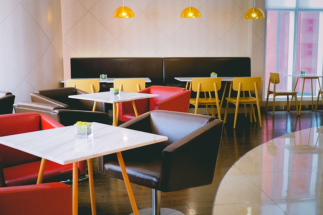
Applying Analogous Color Harmony to Walls and Furniture
When it comes to creating a cohesive interior, painting your walls in analogous colors is a great starting point. By choosing neighboring hues on the color wheel, you can achieve a harmonious and balanced look in your space.
Once you have your walls painted, it’s important to select furniture and decor in harmonizing hues to complete the overall aesthetic.
Painting Walls in Analogous Colors
Choose complementary shades for painting your walls in analogous colors to create a visually pleasing and harmonious atmosphere in your home. When selecting the colors, keep in mind that analogous colors are those that are next to each other on the color wheel.
Here are three tips to help you achieve the desired effect:
-
Start by choosing a dominant color for your walls. This will be the main hue that sets the tone for the room.
-
Next, select two neighboring colors on the color wheel that complement the dominant shade. These colors will add depth and interest to the space.
-
Consider using different shades and tones within the chosen colors to create a subtle gradient effect. This will enhance the overall aesthetic and create a cohesive look.

Selecting Furniture and Decor in Harmonizing Hues
To create a cohesive look in your home, start by selecting furniture and decor that complement the dominant color of your walls. By choosing pieces that harmonize with the wall color, you can create a seamless and balanced aesthetic.
For example, if your walls are painted in a soft blue hue, consider incorporating furniture and decor in shades of blue or other cool tones like green or purple. This will create a soothing and tranquil atmosphere in your space.
On the other hand, if your walls are a warm shade of yellow or orange, opt for furniture and decor in complementary warm tones like red or brown. This will create a cozy and inviting ambiance.
Using Accent Colors to Enhance the Design
Using accent colors can greatly enhance the overall design of an interior space. By strategically incorporating pops of color, you can create visual interest and bring life to your room. Accent colors serve as focal points, drawing attention to specific areas or objects. They add depth and personality to your space, making it feel more vibrant and inviting.

To help you understand the impact of accent colors, take a look at the table below. This table showcases different accent color options and the emotions they evoke in a room:
| Accent Color | Emotions |
|---|---|
| Red | Passion |
| Yellow | Happiness |
| Blue | Tranquility |
| Green | Freshness |
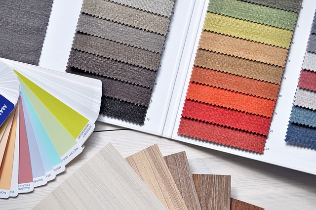
Incorporating Patterns and Textures
Now let’s dive into the next subtopic: incorporating patterns and textures into your design.
You can use patterns in analogous colors to create a cohesive and visually pleasing look.
Additionally, introducing textured elements adds visual interest and depth to your space.
Using Patterns in Analogous Colors
When incorporating patterns into your analogous color scheme, remember to choose designs that enhance the cohesive look of your interiors. Opt for patterns that complement the neighboring hues in your color palette, creating a harmonious and visually pleasing space.
Consider using patterns in fabrics, such as curtains, throw pillows, or upholstered furniture, to add depth and interest to your interiors. Incorporate patterns with similar tones and shades to maintain the overall color harmony in your space. For example, if your analogous color scheme consists of blues and greens, choose patterns that feature these colors in various shades and intensities.
This will help tie the different elements of your design together and create a cohesive and visually appealing look for your interiors.
Introducing Textured Elements for Visual Interest
To add visual interest, consider incorporating textured elements into your design. Textured elements can bring depth and dimension to your space, making it feel more inviting and engaging.
Think about incorporating materials like textured wallpapers, woven fabrics, or natural materials such as rattan or jute. These elements can be used in various ways, such as adding texture to walls, furniture, or accessories.
A textured accent wall can create a focal point in a room, while textured pillows or throws can add a cozy and tactile element to your seating area. Don’t be afraid to mix and match different textures to create a visually dynamic space.
Lighting and Its Impact on Color Perception
When choosing light fixtures for your space, it’s important to consider how they will complement your color scheme.
The right lighting can enhance the colors in your room and create a cohesive and harmonious look.
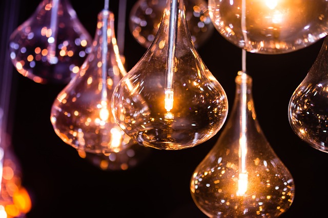
Additionally, understanding how lighting can affect color perception will help you make informed decisions about the type of lighting to use in each area of your home.
Choosing Light Fixtures to Complement the Color Scheme
Make sure you’re selecting light fixtures that complement the color scheme for a cohesive interior. The right lighting can enhance the overall aesthetic of your space and create a harmonious atmosphere.
To ensure that your light fixtures blend seamlessly with your chosen color scheme, consider the following factors:
-
Color Temperature: Opt for light fixtures that emit a warm or cool light, depending on the color temperature of your room. This will help maintain the desired ambiance.
-
Material and Finish: Choose fixtures that match the material and finish of your furniture and decor. For example, if you have a room with brass accents, consider light fixtures with a brass finish to tie everything together.
-
Style: Select fixtures that align with the overall style of your interior. Whether it’s modern, traditional, or eclectic, make sure the fixtures contribute to the overall aesthetic.
Understanding How Lighting Can Affect Color Perception
Understanding how lighting affects color perception is crucial in creating visually appealing spaces. The type of lighting, whether natural or artificial, significantly impacts how colors appear. Warm lighting enhances warm hues like reds and yellows, while cooler lighting intensifies blues and greens. The intensity and direction of light also influence color perception. Bright, direct light saturates colors, while diffused light softens them. Considering these factors when choosing lighting is essential for achieving the desired aesthetic and mood.
Avoiding Color Overload
When it comes to creating a visually appealing space, finding the right balance of colors is crucial. By carefully selecting and combining different hues, you can achieve a harmonious and pleasing aesthetic.
Additionally, simplifying the color scheme can give your interior a clean and elegant look, creating a sense of sophistication and tranquility.
Finding the Right Balance of Colors
Finding the right balance of colors can be challenging, but it’s essential for creating a cohesive and visually pleasing interior. When decorating your space, you want to make sure that the colors you choose complement each other and work together harmoniously.
One way to achieve this balance is by using analogous color harmony. Analogous colors are those that are next to each other on the color wheel, such as blue and green or yellow and orange. By selecting hues that are close in shade and tone, you can create a sense of unity and flow throughout your space.
However, it’s important not to overdo it. Too many analogous colors can overwhelm the eye and make the room feel chaotic. Aim for a mix of warm and cool tones to create a well-balanced and inviting atmosphere.

Simplifying the Color Scheme for a Clean and Elegant Look
Simplifying the color scheme can create a clean and elegant look for your space. By choosing a limited palette of colors that are closely related, you can achieve a cohesive and harmonious atmosphere.
Opt for analogous colors, which are neighboring hues on the color wheel. This means selecting colors that are next to each other, such as blue and green or red and orange. By sticking to these similar shades, you create a sense of unity and balance in your room. This approach also eliminates the overwhelming feeling of too many contrasting colors.
Keep the accents and accessories in neutral tones to complement the simplified color scheme. The result will be a sophisticated and visually appealing space that exudes simplicity and elegance.
Creating Flow Between Rooms
To create a sense of flow between rooms, it’s important to choose colors that complement each other. By selecting colors that harmonize and work well together, you can create a seamless transition from one room to another.
Consider using an analogous color scheme, where neighboring hues on the color wheel are used. For example, if you have a blue living room, you can choose a green shade for the adjacent dining room. This will create a visual connection between the two spaces, making them feel cohesive and connected.
Additionally, you can use accent colors to tie the rooms together. For instance, if you have a red accent wall in the living room, incorporate small touches of red in the dining room, such as red cushions or artwork. These subtle color choices will help create a harmonious flow throughout your home.
Experimenting with Different Color Combinations
Experimenting with different color combinations can help you find the perfect palette for each room in your home. By trying out various hues and tones, you can discover the ideal balance that creates a harmonious and visually appealing space. Colors have the power to evoke certain moods and emotions, so it’s important to select ones that align with the atmosphere you want to create. To help you get started, here’s a table showcasing three analogous color combinations that work well together:
| Color 1 | Color 2 | Color 3 |
|---|---|---|
| Blue | Green | Purple |
| Yellow | Orange | Red |
| Pink | Peach | Coral |
These combinations consist of neighboring hues on the color wheel, creating a cohesive and unified look. Remember to consider factors like natural light, room size, and existing furniture when choosing your colors. Have fun experimenting and finding the perfect palette for your home!
Embracing Your Personal Style
Embracing your personal style is all about expressing who you are through the choices you make in your home decor.
Your home should be a reflection of your unique personality and taste. Whether you prefer a minimalist and modern aesthetic or a cozy and eclectic vibe, it’s important to create a space that feels authentic to you.
Start by considering the colors, patterns, and textures that resonate with your personal style. Do you gravitate towards bold and vibrant hues, or do you prefer a more muted and neutral palette? Think about the overall atmosphere you want to create in your home and choose pieces that align with that vision.
Frequently Asked Questions
Can analogous color harmony be applied to exterior spaces, such as a garden or patio?
Yes, analogous color harmony can be applied to exterior spaces like gardens or patios. By using neighboring hues, you can create a cohesive and visually pleasing outdoor environment that complements the surrounding landscape.
How can I incorporate analogous color harmony into a minimalist design style?
Incorporate analogous color harmony into your minimalist design style by choosing neighboring hues that create a cohesive and harmonious look. Use a limited color palette and focus on subtle variations in shades and tones.
Are there any cultural associations or meanings attached to specific analogous color combinations?
There can be cultural associations or meanings attached to specific analogous color combinations. These associations vary across different cultures and can influence the overall atmosphere and mood of a space.
Can I use analogous color harmony in a small space without it feeling overwhelming?
Yes, you can use analogous color harmony in a small space without it feeling overwhelming. By choosing softer shades and using them strategically, you can create a cohesive and visually pleasing atmosphere that doesn’t overcrowd the room.
What are some tips for incorporating analogous color harmony into a rental space without making permanent changes?
To incorporate analogous color harmony into a rental space without making permanent changes, focus on temporary solutions like using removable wallpaper, accent pillows, and artwork. These can add pops of color and create a cohesive look without damaging the walls.

Conclusion
In conclusion, embracing analogous color harmony in your interior design can create a cohesive and visually pleasing space. By understanding and choosing the right color palette, exploring different schemes, and creating balance and contrast, you can achieve a harmonious look.
Applying this harmony to walls and furniture, avoiding color overload, and creating flow between rooms will further enhance the overall design.
Lastly, don’t be afraid to experiment with different combinations and embrace your personal style to truly make your space unique and inviting.