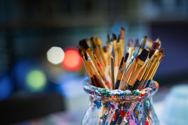
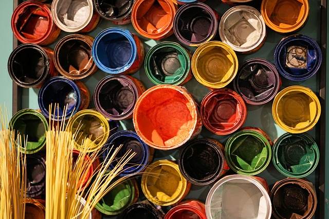
Time-Tested Color Combinations

Designers’ Favorites Revealed
Looking to add a pop of color to your space? Discover the secrets of top designers and their go-to color combinations in our article, ‘Time-Tested Color Combinations: Designers’ Favorites Revealed.’
From classic black and white to vibrant jewel tones, this guide has it all. Get inspired by elegant neutrals, playful primary colors, and moody dark shades.
With these time-tested combinations, you’ll be able to create a stylish and harmonious look in no time.
Key Takeaways
- Classic black and white combinations are timeless, versatile, and make a bold and sophisticated statement in fashion, interior design, and graphic design.
- Soft pastels create a delicate and soothing color palette, evoking a sense of calm and tranquility. They are sophisticated, timeless, and appealing.
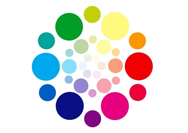
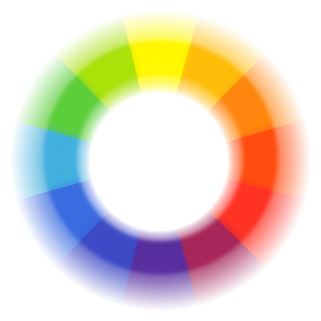
- Bold contrasts in color create a dynamic visual impact and add depth to a design. Pairing colors on opposite sides of the color wheel or contrasting saturations or intensities grabs attention.
- Coastal blues and whites create a serene and refreshing design inspired by the sea. Soft blue hues and white accents mimic waves, while striped patterns and natural materials enhance the coastal vibe.
Classic Black and White
Classic black and white is a timeless color combination that designers love. It’s a pairing that never goes out of style, and for good reason.

The stark contrast between these two colors creates a bold and sophisticated look that can elevate any design. Whether it’s in fashion, interior design, or graphic design, black and white always makes a statement.
The simplicity of this color combination allows other elements to shine, making it a versatile choice for any project. From elegant black tie events to minimalist home decor, black and white can adapt to any aesthetic.
So next time you’re in need of a color palette that exudes elegance and simplicity, turn to the classic black and white combination that designers swear by.
Elegant Neutrals
For an effortless and sophisticated look, you can’t go wrong with elegant neutrals. Whether you’re dressing up for a special occasion or putting together your everyday outfit, neutrals are the perfect choice.

The beauty of neutrals lies in their versatility and timeless appeal. With shades like beige, ivory, taupe, and gray, you can create a chic and polished ensemble that never goes out of style. Mix and match different neutral tones to add depth and dimension to your outfit.
Pair a beige blazer with ivory trousers or a taupe dress with a gray cardigan. The possibilities are endless.
So next time you’re looking for a foolproof way to look effortlessly stylish, opt for elegant neutrals and embrace their understated charm.
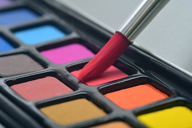
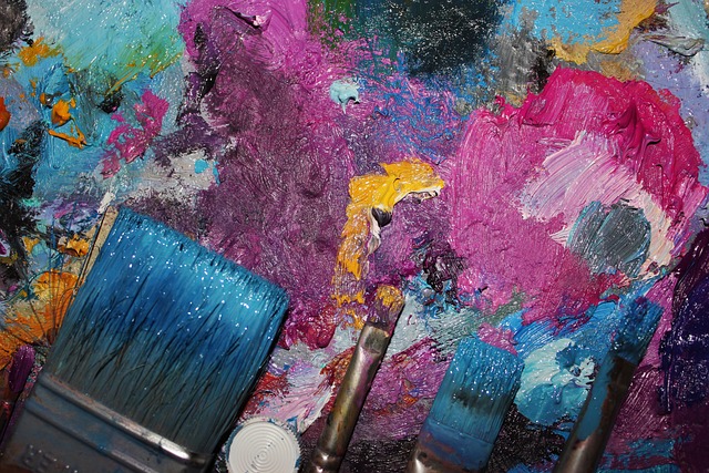
Vibrant Jewel Tones
Get ready to add a pop of boldness to your color palette with vibrant jewel tones.
Experiment with bold jewel color pairings to create eye-catching combinations that will make a statement in any room.
Achieve vibrant color harmony by mixing and matching jewel tones to create a visually stunning and cohesive look.
Bold Jewel Color Pairings
You can’t go wrong with bold jewel color pairings because they add a vibrant and luxurious touch to any space. Combine deep sapphire blue with emerald green for a striking and regal combination that exudes opulence.
The rich, velvety hues of these jewel tones create a sense of drama and depth, instantly elevating the aesthetic of your room.

For a more daring look, pair amethyst purple with topaz yellow. The contrasting colors create an eye-catching and energetic atmosphere that is sure to make a statement.
Whether you choose to use these bold jewel color pairings in your living room, bedroom, or even in your office space, they will inject personality and sophistication into your decor.
So go ahead and experiment with these captivating combinations to create a space that is truly memorable.
Vibrant Color Harmony
Achieve vibrant color harmony by combining bold jewel tones in unexpected ways. Don’t limit yourself to the traditional color schemes; instead, experiment with different combinations to create a visually stunning effect.
Mix deep emerald greens with rich sapphire blues for a luxurious and regal ambiance. Pair vibrant ruby reds with luscious amethyst purples to create a bold and passionate atmosphere. Don’t be afraid to incorporate pops of citrine yellow or topaz orange to add a touch of warmth and energy.
The key to achieving vibrant color harmony is to balance the intensity of each color while allowing them to complement and enhance one another. So go ahead, break the rules, and create your own unique and captivating color palette that will leave a lasting impression.
Soft Pastels
Soft pastels are a popular choice among designers for creating a delicate and soothing color palette. They offer a subtle and elegant look that can bring a sense of calm and tranquility to any design project. With their gentle hues and soft tones, pastels are perfect for creating a dreamy and ethereal atmosphere.
- Pastel pink: A soft and romantic shade that adds a touch of femininity to any space.
- Pastel blue: A calming and serene color that evokes a sense of peace and tranquility.
- Pastel green: A fresh and rejuvenating hue that brings a touch of nature indoors.
- Pastel yellow: A cheerful and sunny shade that adds warmth and brightness to any room.
- Pastel lavender: A gentle and soothing color that promotes relaxation and calmness.
Incorporating soft pastels into your design can create a sophisticated and elegant look that is timeless and appealing. So, why not embrace the beauty of pastels and create a harmonious and soothing color palette for your next design project?
Bold Contrasts
If you want to make a bold statement with your design, try incorporating contrasting colors for a striking and eye-catching effect.
Bold contrasts can create a dynamic visual impact that grabs attention and adds depth to your design.
Think about pairing colors that are on opposite sides of the color wheel, like black and white, or red and green. These combinations create a strong contrast that instantly catches the eye.
Another way to achieve bold contrasts is by using colors with different saturations or intensities. For example, pairing a vibrant, saturated color with a muted or desaturated color can create a dramatic contrast.
Earthy and Natural
To create an earthy and natural design, try incorporating warm, organic tones that evoke a sense of tranquility and harmony. Imagine stepping into a space that instantly connects you to nature, where you can feel grounded and at peace.
Here are three ways to achieve this:
- Use earthy neutrals: Choose colors like warm beige, soft browns, and muted greens to create a soothing and calming atmosphere. These tones mimic the natural world and bring a sense of serenity to any room.
- Bring in natural materials: Incorporate elements like wood, stone, and jute to add texture and authenticity to your space. These materials not only look beautiful but also enhance the organic feel of your design.

- Add pops of nature-inspired colors: Introduce accents of earthy reds, burnt oranges, and deep blues to inject energy and depth into your design. These splashes of color will create visual interest and balance within your natural palette.
Coastal Blues and Whites
Incorporate coastal blues and whites to create a serene and refreshing design inspired by the sea. When designing your space, think of the calming and tranquil qualities of the ocean.
Choose a soft blue hue for your walls to create a sense of serenity and peace. Add white accents through furniture or decor to mimic the waves crashing onto the shore.
Use striped patterns in shades of blue and white to evoke the feeling of a breezy beach house. Incorporate natural materials like rattan or jute to bring in elements of the coastline.
This color combination will instantly transport you to a coastal retreat, making your space feel light, airy, and effortlessly chic.
Modern Monochromes
Looking to create a bold and sleek look for your space?
Dive into the world of modern monochromes with bold black and white color schemes and sleek minimalistic palettes.
These key points will help you achieve a contemporary and sophisticated aesthetic that is both timeless and visually striking.
Embrace the power of contrast and simplicity in your design choices to create a space that exudes modern elegance.
Bold Black and White
Bold black and white is a classic color combination that designers often favor. It exudes elegance, simplicity, and sophistication. When used together, these contrasting colors create a striking visual impact that catches the eye. Black represents power, formality, and mystery, while white symbolizes purity, cleanliness, and simplicity. This timeless duo has been used in various design disciplines, from fashion to interior design, to create a bold and timeless aesthetic. To illustrate the versatility of this combination, here is a table showcasing different design applications that benefit from the bold black and white color palette:
| Design Application | Description |
|---|---|
| Graphic Design | Black and white graphics are attention-grabbing and convey a modern and minimalist feel. |
| Fashion | Black and white outfits are stylish and versatile, making a bold statement in any season. |
| Interior Design | Black and white interiors create a sleek and contemporary ambiance, showcasing clean lines and highlighting architectural details. |
Sleek Minimalistic Palettes
To achieve a sleek and minimalistic aesthetic, you can opt for palettes that feature clean lines and a limited color range. By choosing a limited color range, such as shades of white, gray, and black, you can create a sense of simplicity and sophistication in your space.
These neutral tones allow for a harmonious and cohesive look, while the clean lines add a sense of order and clarity. Incorporating minimalistic furniture and decor pieces with simple shapes and designs further enhances the overall sleekness of the palette.
When it comes to accessories, you can add pops of color sparingly to create visual interest without overwhelming the space. Overall, a sleek minimalistic palette is perfect for those who appreciate a clean and uncluttered look in their home or office.
Timeless Red and Gold
You can’t go wrong with the classic combination of red and gold – it always adds a touch of elegance and sophistication to any design. Whether you’re decorating your living room or planning a special event, incorporating these two colors is a surefire way to make a statement.
Here are three reasons why red and gold are a timeless duo:
- Richness: Red and gold exude opulence and luxury. The deep red shade brings warmth and intensity, while the golden accents provide a radiant and regal touch.

- Contrast: The contrast between red and gold creates a visually striking effect. The boldness of red enhances the shimmering brilliance of gold, resulting in a captivating combination that commands attention.
- Symbolism: Red is often associated with passion, energy, and power, while gold represents wealth, success, and prosperity. Together, they evoke a sense of grandeur and prestige.
Fresh Citrus Hues
When it comes to adding a vibrant pop of color to your space, fresh citrus hues are a fantastic choice. These bright and invigorating colors, such as lemon yellow, lime green, and tangerine orange, can instantly lift the mood of any room.
Whether you want to create a lively and energetic atmosphere in your living room or add a touch of zest to your kitchen, citrus hues are the way to go. Imagine waking up to the cheerful glow of a sunny yellow accent wall or enjoying a refreshing meal in a dining area adorned with bright orange chairs.

With fresh citrus hues, you can bring a sense of positivity and vitality into your home, making it a truly uplifting and inspiring space. So go ahead, embrace the vibrancy of citrus colors and let your space come alive with energy and zest.
Moody Dark Shades
Imagine transforming your space with moody dark shades, creating a sense of depth and sophistication that will leave you feeling cozy and relaxed.
Here are three ways to incorporate these colors into your design:
- Accent walls: Paint one wall in a rich, deep hue like charcoal or navy blue to create a focal point in your room. This will add visual interest and make the space feel more intimate.
- Furniture and textiles: Choose dark-colored furniture pieces, such as a velvet sofa in deep burgundy or a leather armchair in espresso brown. Pair them with lush, textured fabrics like velvet and faux fur for a luxurious touch.
- Lighting and accessories: Use lighting fixtures with dimmers to create an ambiance that suits your mood. Add metallic accents like brass or copper to enhance the dramatic effect of the dark shades.
Playful Primary Colors
Playful primary colors can instantly inject a sense of fun and vibrancy into any space. Whether it’s a child’s bedroom, a lively kitchen, or a creative workspace, these colors have the power to uplift and energize.
Imagine walking into a room adorned with bright reds, vibrant yellows, and vivid blues. The combination of these bold hues creates a joyful atmosphere that is hard to resist. You can’t help but feel a surge of positivity and excitement as you take in the playful palette.
These primary colors have a way of capturing attention and inspiring creativity. So, if you’re looking to infuse your space with a dose of cheerfulness, don’t hesitate to embrace the power of playful primary colors.
Frequently Asked Questions
How Do I Choose the Right Color Combination for My Specific Design Project?
You can choose the right color combination for your specific design project by considering the mood and message you want to convey. Experiment with different colors and see which ones work best together.
Are There Any Color Combinations That Are Universally Considered Timeless and Versatile?
There are definitely color combinations that are universally timeless and versatile. They can add a sense of elegance and sophistication to any design. Let’s explore some of these classic combinations together.
What Are Some Tips for Incorporating Bold Color Contrasts in a Design Without Overwhelming the Overall Aesthetic?
To incorporate bold color contrasts without overwhelming your design, start by choosing complementary colors. Use one color as the dominant hue and the other as an accent. Experiment with different shades and balance the saturation for a harmonious aesthetic.

Can You Provide Examples of Color Combinations That Work Well for Different Moods or Atmospheres?
Sure! Color combinations can create different moods in a design. For a calm atmosphere, try pairing blues and whites. For a vibrant feel, go for bold reds and yellows. Experiment and see what works best for you!
Are There Any Cultural or Symbolic Meanings Associated With Certain Color Combinations That Designers Should Be Aware Of?
Are you wondering if there are any cultural or symbolic meanings tied to specific color combinations that designers should know? Well, there sure are! Let’s dive into the fascinating world of color symbolism.
Conclusion
So, there you have it, a glimpse into the world of time-tested color combinations.
Designers have revealed their favorite pairings, from classic black and white to vibrant jewel tones.
Whether you prefer elegant neutrals or bold contrasts, there is a color combination for every style and taste.
Experiment with soft pastels or embrace the timeless allure of red and gold.
Don’t be afraid to play with fresh citrus hues or moody dark shades.
And remember, the world of color is yours to explore, so have fun and let your creativity shine!