
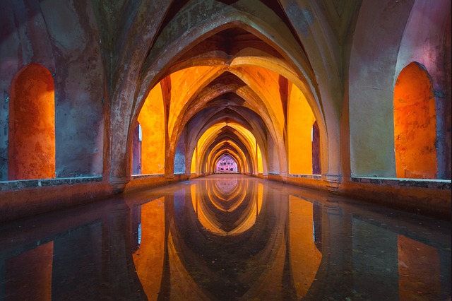
Complementary Colors
 The Art Of Balancing Opposites In Your Design
Have you ever wanted to bring a sense of harmony and balance to your interior design? Look no further than the art of complementary colors.
In this article, we will guide you through the process of understanding, choosing, and incorporating complementary colors into your home. From creating contrast to adding accents, we will show you how to achieve a stunning and cohesive look.
Get ready to transform your space and unleash your inner designer.
Key Takeaways
- Complementary colors are opposite each other on the color wheel and create visual contrast and harmony in interior design.
- Choosing and creating contrast with complementary colors involves selecting colors that are opposite each other on the color wheel and experimenting with different shades and hues.
- Incorporating complementary colors in walls, furniture, and decor can create a vibrant and harmonious design.
- Balancing warm and cool tones with complementary colors helps create a visually stimulating and inviting atmosphere.
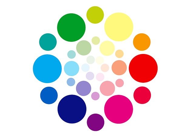
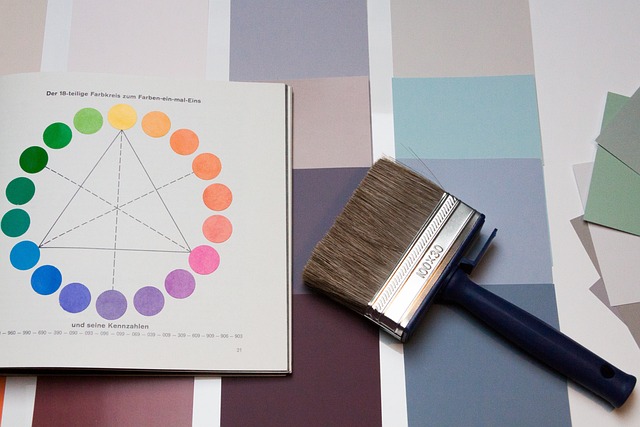
Understanding Complementary Colors
To understand complementary colors, you’ll need to grasp how they work together to create a harmonious and dynamic interior design. Complementary colors are pairs of colors that are opposite each other on the color wheel. When used together, they create a visual contrast that is pleasing to the eye.
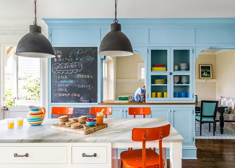
For example, red and green, blue and orange, and yellow and purple are complementary color pairs. These colors have the power to enhance each other and bring a sense of balance to a space. By incorporating complementary colors into your interior design, you can create a vibrant and energetic atmosphere.
Whether it’s through furniture, accessories, or paint choices, understanding how complementary colors interact is key to achieving a visually stunning and cohesive design.
Choosing the Right Complementary Color Pairings
When selecting the perfect color combinations for your home decor, it’s crucial to choose the right pairings that complement each other. You want your space to feel harmonious and balanced, with colors that enhance each other rather than clash.
Here are three tips to help you choose the right complementary color pairings:
- Consider the color wheel: Look for colors that are opposite each other on the color wheel. These complementary colors create a striking contrast that can add visual interest to your space.
- Start with a dominant color: Choose one color that will be the main focal point in your room. Then, select its complementary color as an accent. This will create a dynamic and balanced look.
- Play with shades and hues: Don’t be afraid to experiment with different shades and hues of your chosen colors. This can add depth and dimension to your space, creating a visually pleasing environment.
Creating Contrast with Complementary Colors
Consider experimenting with different shades and hues to add depth and dimension to your space, creating a visually striking contrast. By incorporating complementary colors, you can achieve a dynamic and vibrant look that catches the eye. Complementary colors are opposite each other on the color wheel, such as red and green, blue and orange, or yellow and purple. The contrast they create can bring life and energy to any room. Here’s a table showcasing some popular complementary color pairings to inspire your design choices:
| Complementary Colors | Examples |
|---|---|
| Red & Green | Christmas decor, rustic-themed spaces |
| Blue & Orange | Nautical-themed rooms, vibrant and energetic spaces |
| Yellow & Purple | Regal and luxurious interiors, bohemian-inspired decor |
Embrace the power of complementary colors to transform your space into a visually stunning masterpiece.
Incorporating Complementary Colors in Walls and Furniture
When it comes to painting your walls with complementary colors, you can create a dynamic and visually appealing space. By choosing colors that are opposite on the color wheel, such as blue and orange or purple and yellow, you can achieve a balanced and harmonious look.
Additionally, when selecting furniture and decor, consider opting for pieces in complementary hues to further enhance the overall design of your space.
Painting walls with complementary colors
Using complementary colors on your walls can create a vibrant and harmonious interior design. Here are some tips to keep in mind:
- Choose colors that are opposite each other on the color wheel, such as blue and orange or purple and yellow.
- Use one color as the dominant hue and the other as an accent to create balance.
- Consider the lighting in the room, as it can affect how the colors appear. Natural light can enhance the vibrancy of the colors, while artificial light can create a cozy atmosphere.
- Experiment with different shades and tones of the complementary colors to find the perfect combination for your space.
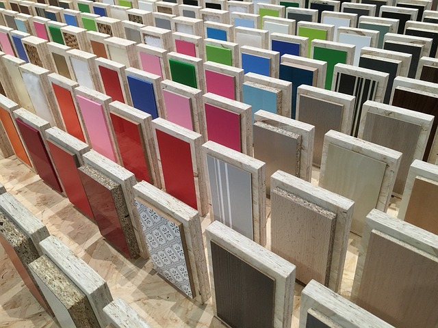
Choosing furniture and decor in complementary hues
To create a cohesive look in your space, try selecting furniture and decor that feature complementary hues. By incorporating colors that are opposite each other on the color wheel, you can achieve a balanced and visually appealing interior design. Consider the following table as a guide for choosing complementary colors:
| Primary Color | Complementary Color |
|---|---|
| Blue | Orange |
| Red | Green |
| Yellow | Purple |
For example, if you have a blue sofa, complement it with orange throw pillows or a side table. This contrasting combination will add depth and interest to your room. Similarly, if you have a red accent chair, pair it with a green rug or artwork to create a striking visual impact. Remember, the key is to find a balance between the colors and ensure they enhance each other rather than clash. So, go ahead and explore the world of complementary hues to transform your space into a harmonious and stylish haven.
Adding Accents and Accessories in Complementary Colors
When it comes to adding accents and accessories in complementary colors to your interior design, throw pillows and blankets are a great place to start.
By incorporating complementary colors in these soft furnishings, you can create a harmonious and visually appealing look in your space.

Additionally, artwork and rugs can also be used to bring complementary colors into your decor, adding depth and interest to the overall design.
Using complementary colors in throw pillows and blankets
Don’t forget to incorporate complementary colors in your choice of throw pillows and blankets for a vibrant and harmonious interior design. By using complementary colors, you can create a visually appealing and balanced space. Here are four ways to effectively use complementary colors in your throw pillows and blankets:
- Pair warm and cool tones: Combine warm colors like red and orange with cool colors like blue and green to create an eye-catching contrast.
- Use analogous colors: Choose colors that are next to each other on the color wheel, such as blue and purple or orange and yellow, for a harmonious and soothing look.
- Opt for contrasting textures: Mix different textures, like a smooth velvet pillow in a complementary color with a chunky knit blanket, for added visual interest.
- Experiment with patterns: Incorporate patterns that feature complementary colors, such as stripes or geometric prints, to create a dynamic and lively atmosphere.
Incorporating complementary colors in artwork and rugs
You can create a visually striking and harmonious look by incorporating contrasting hues in your choice of artwork and rugs. By using complementary colors, which are located opposite each other on the color wheel, you can achieve a vibrant and balanced interior design.
For example, if your walls are painted in a cool blue shade, consider adding a rug with warm orange tones or artwork with pops of yellow. The contrasting colors will create a dynamic and eye-catching focal point in the room.

Additionally, make sure to consider the size and scale of your artwork and rugs to ensure they complement the overall space. Whether you choose bold and vibrant or subtle and muted hues, incorporating complementary colors in your artwork and rugs is a surefire way to add depth and visual interest to any room.
Balancing Warm and Cool Tones with Complementary Colors
When designing your space, it’s important to consider the use of warm and cool complementary colors.
By using warm colors like reds, oranges, and yellows in conjunction with cool colors like blues, greens, and purples, you can create a visually stimulating and balanced design.
Finding a harmonious balance between warm and cool tones will help create a cohesive and inviting atmosphere in your space.
Using warm and cool complementary colors in your design
To create a harmonious interior design, try incorporating warm and cool complementary colors into your space. By using this technique, you can achieve a balanced and visually appealing atmosphere that will make your home cozy and inviting.
Here are some ideas to help you get started:
- Warm and Cool Pairings:
- Pair a warm color like red or orange with a cool color like blue or green for a striking contrast.
- Use warm and cool shades of the same color to create depth and dimension.
- Experiment with different ratios of warm and cool colors to find the perfect balance for your space.
- Accent Pieces:
- Add pops of warm and cool colors through accessories like throw pillows, rugs, and artwork.
- Consider using warm and cool lighting fixtures to enhance the color scheme.
- Furniture and Textiles:
- Choose furniture pieces and fabrics in warm and cool colors to create a cohesive look.
- Mix and match textures in warm and cool tones to add visual interest.
By incorporating warm and cool complementary colors into your design, you can create a space that is not only visually appealing but also balanced and inviting.
So go ahead, experiment with different combinations and unleash your creativity!
Creating a harmonious balance between warm and cool tones
Now that you understand the power of warm and cool complementary colors in your interior design, it’s time to delve deeper into the art of creating a harmonious balance between these tones. By skillfully combining warm and cool colors, you can achieve a visually stunning and emotionally pleasing environment in your home. To assist you in this endeavor, here is a helpful table that showcases some popular warm and cool color combinations:
| Warm Colors | Cool Colors |
|---|---|
| Red | Blue |
| Orange | Green |
| Yellow | Purple |
| Pink | Turquoise |
Using Complementary Colors in Different Design Styles
Incorporating complementary colors in modern design can bring a bold and vibrant energy to your space. By using contrasting hues like blue and orange or purple and yellow, you can create a visually striking and dynamic environment.
On the other hand, using complementary colors in traditional or eclectic styles can add a touch of sophistication and harmony to your interior.
Incorporating complementary colors in modern design
Using complementary colors in modern design can create a striking and bold aesthetic. By strategically pairing colors that are opposite each other on the color wheel, you can achieve a visually dynamic and harmonious space.
Here are four ways you can incorporate complementary colors in your modern design:
- Accent wall: Paint one wall in a bold, complementary color to create a focal point in your room.
- Furniture: Choose furniture pieces in complementary colors to add visual interest and create a sense of balance.
- Accessories: Use complementary color accessories such as throw pillows, rugs, and artwork to bring pops of color into your space.
- Color blocking: Experiment with color blocking techniques by combining complementary colors in different areas of your room to create a contemporary and energetic look.
Using complementary colors in traditional or eclectic styles
To achieve a traditional or eclectic style, try incorporating contrasting hues into your space. By using complementary colors, you can create a visually striking and balanced look.
For a traditional style, consider pairing warm tones like red and green or blue and orange. These color combinations will add depth and richness to your space while maintaining a classic feel.
If you prefer an eclectic style, experiment with bold and unexpected color combinations. For example, pair vibrant yellows with deep purples or bright blues with fiery oranges. This will create an eye-catching and unique look that reflects your individuality.
Don’t be afraid to mix and match different complementary colors to achieve the perfect blend of contrast and harmony in your space.
Playing with Light and Dark Shades of Complementary Colors
In this discussion, you’ll explore the exciting world of using light and dark tones to create depth and dimension in your design. By playing with these contrasting shades, you can add visual interest and make your space feel more dynamic and layered.
You’ll also learn how to use shadows and highlights strategically to enhance complementary color schemes. This will help you create a harmonious and balanced look that is both visually appealing and impactful.
Exploring the use of light and dark tones for depth and dimension
By incorporating light and dark tones, you can create depth and dimension in your interior design. Here are three ways to effectively use light and dark tones in your space:
- Contrast: Pairing light and dark colors creates a striking contrast that immediately catches the eye. For example, painting one wall a dark shade while keeping the rest of the room light can make the wall appear further away, giving the illusion of more space.
- Highlighting: Using light tones to highlight specific areas or features in your design can draw attention and create visual interest. For instance, placing a light-colored rug underneath a dark-colored coffee table can make the table stand out, adding depth to the room.
- Balance: Balancing light and dark tones throughout your space creates a harmonious and well-designed look. Mixing light and dark furniture, accessories, and artwork can create a sense of balance and visual appeal.
Using shadows and highlights to enhance complementary color schemes
Enhance the depth and visual appeal of your space by strategically using shadows and highlights to bring out the best in your chosen color scheme. By playing with light and shadow, you can create a dynamic and captivating environment that highlights the beauty of complementary colors.
To effectively use shadows and highlights, consider the following tips:
| Shadows | Highlights |
|---|---|
| Create depth | Add brightness |
| Enhance contrast | Bring attention |
| Add drama | Illuminate space |
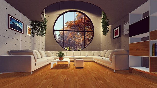
Creating a Focal Point with Complementary Colors
Are you looking to make a certain area in your space stand out? One effective way to do this is by using complementary colors.
By pairing colors that are opposite each other on the color wheel, you can draw attention to a specific area and create visual interest and depth.
Adding a focal point with complementary colors can truly transform the look and feel of your interior design.
Using complementary colors to draw attention to a specific area
Create a focal point in your interior design by using complementary colors to draw attention to a specific area.
Complementary colors are pairs of colors that are opposite each other on the color wheel, such as blue and orange, or red and green. By incorporating these colors into your design, you can create a visually striking and balanced space.
For example, if you have a neutral-colored room, you could use a vibrant orange accent wall to draw attention to a specific area, such as a fireplace or a piece of artwork. This will not only add visual interest but also create a sense of harmony and coherence in your design.
Adding visual interest and depth with a focal point
To add visual interest and depth to your space, consider using a focal point that draws the eye towards a specific area.
A focal point serves as the centerpiece of your design, capturing attention and creating a sense of balance in the room. By strategically placing a focal point, such as a bold piece of artwork or a statement furniture item, you can instantly enhance the overall aesthetic appeal of your space.
Think about the colors, textures, and shapes that complement your existing interior design and use them to create a focal point that stands out. This will not only add visual interest but also create a sense of depth and dimension in your room.
Avoiding Color Overload with Complementary Colors
Don’t overwhelm your space with too many colors by using complementary colors strategically.
When it comes to interior design, finding the right balance is key. Complementary colors are pairs of colors that are opposite each other on the color wheel, such as blue and orange or yellow and purple. By using these colors strategically, you can create a harmonious and visually appealing space.
Instead of using a multitude of colors that may clash or compete with each other, choose a main color and then use its complementary color as an accent. This will create a sense of cohesion and allow the colors to complement each other rather than overpowering the space.
Testing and Adjusting Complementary Color Schemes
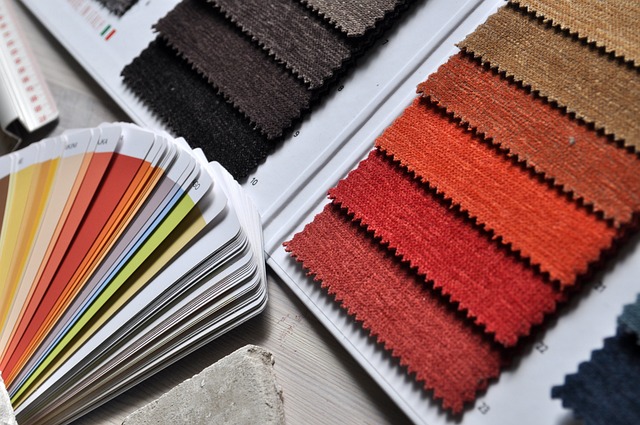
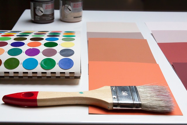
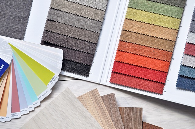
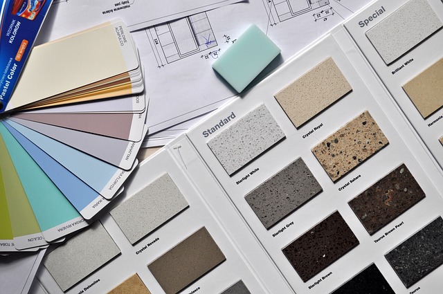
When it comes to testing and adjusting complementary color schemes, you should consider using color samples and swatches to test different combinations. By physically seeing the colors together, you can get a better idea of how they will interact and whether they achieve the desired effect.

If the combination needs some adjustments, don’t hesitate to make changes until you achieve the desired look and feel for your interior design.
Using color samples and swatches to test combinations
Grab color samples and swatches to experiment with different combinations. This will help you visualize how complementary colors can work together in your interior design. By testing out various combinations, you can find the perfect balance between contrasting hues. Use the table below as a guide to explore different pairs of complementary colors:
| Color 1 | Color 2 |
|---|---|
| Blue | Orange |
| Red | Green |
| Purple | Yellow |
| Pink | Green |
| Turquoise | Coral |
Take these samples and swatches and lay them out in different arrangements. See how they interact with each other and with the other elements in the room. You might be surprised by the striking effects that can be achieved by using complementary colors. So get creative and have fun playing with different combinations to find the perfect balance for your interior design.
Making adjustments to achieve the desired effect
To achieve the desired effect, experiment with different combinations of color samples and swatches. Don’t be afraid to make adjustments along the way.

Here are some tips to help you find the perfect balance in your interior design:
- Start with a neutral base color and add pops of complementary colors for a vibrant look.
- Play with different shades of the same color to create depth and dimension.
- Use color psychology to evoke certain moods and emotions in each room.
- Consider the lighting in your space and how it may affect the appearance of your chosen colors.
Remember, interior design is all about personal preference and finding what works best for you. So, have fun with it and trust your instincts.
With a little experimentation and some color samples, you’ll be able to achieve the desired effect in no time.
Seeking Inspiration from Complementary Color Design Examples
Are you looking to explore real-life examples of successful complementary color designs? If so, you can find inspiration from interior design magazines and online resources.

These sources provide a wealth of ideas and examples to help you create a visually appealing and harmonious color scheme in your own space.
Exploring real-life examples of successful complementary color designs
You can find inspiration for successful complementary color designs by looking at real-life examples. Seeing how these colors are used in actual interior designs can give you a better understanding of how to balance opposites and create a visually appealing space. Take a look at the following table, which showcases three different real-life examples of complementary color designs:
| Example 1 | Example 2 | Example 3 |
|---|---|---|
| Blue and orange | Purple and yellow | Green and red |
| Cool and warm | Bold and vibrant | Earthy and rich |
| Calming and stimulating | Luxurious and energetic | Natural and cozy |
Each of these examples demonstrates how complementary colors can be used to create different moods and atmospheres. By studying these real-life designs, you can gain inspiration and ideas for your own complementary color schemes.
Finding inspiration from interior design magazines and online resources
Now that you’ve seen some real-life examples of successful complementary color designs, it’s time to find inspiration for your own interior design projects.
One of the best ways to gather ideas and stay up-to-date with the latest trends is by exploring interior design magazines and online resources. Here’s how you can make the most out of these valuable sources:
- Interior Design Magazines: Flip through the glossy pages of magazines like Architectural Digest or Elle Decor for stunning visuals and expert advice. Look for articles that focus on complementary color schemes and take note of the design elements that catch your eye.
- Online Design Blogs: Follow popular design blogs such as Apartment Therapy or Design*Sponge to discover unique and innovative uses of complementary colors. These blogs often feature real homes and provide a wealth of inspiration, along with helpful tips and tricks.
- Social Media: Use platforms like Pinterest and Instagram to create mood boards and save images that resonate with your design vision. Follow interior designers and influencers who specialize in complementary color schemes to get a constant stream of ideas in your feed.

Frequently Asked Questions
How do complementary colors affect the mood of a room?
Complementary colors can greatly affect the mood of a room. They create a vibrant and dynamic atmosphere by playing off each other’s intensity. The contrasting colors bring energy and interest to your space, making it more lively and visually appealing.
Can I use more than two complementary colors in my design?
Yes, you can use more than two complementary colors in your design. By incorporating additional complementary hues, you can create a vibrant and dynamic space that adds visual interest and a sense of balance.
How can I incorporate complementary colors in a small space?
Incorporate complementary colors in a small space by using them as accents in your decor. Choose one color as the dominant shade and use its complementary color sparingly to create a balanced and visually appealing design.
What are some tips for using complementary colors in a minimalist design style?
Use complementary colors in a minimalist design by selecting a dominant color and using its opposite as an accent. Keep the color palette simple and uncluttered, using neutrals for balance. Avoid overwhelming the space with too many contrasting colors.
Are there any complementary color combinations that are considered outdated or out of style?
Some complementary color combinations may be considered outdated or out of style, but it ultimately depends on personal preference and current design trends. Experiment and find the combination that speaks to you and enhances your space.
Conclusion
So there you have it, the art of balancing opposites in your interior design through the use of complementary colors. By understanding how these colors work together and choosing the right pairings, you can create a visually appealing and harmonious environment.
Creating contrast and incorporating complementary colors in various elements of your space is key. Remember to use accents and accessories to enhance the effect, create a focal point, and avoid color overload.
Don’t forget to seek inspiration from design examples to truly bring your space to life. Happy designing!