

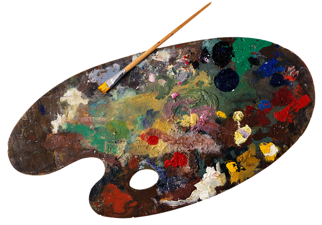
Cool Vs. Warm Colors
Understanding The Temperature Of Hues
Are you curious about the temperature of colors and how it can impact your design choices?
In this article, we’ll explore the differences between cool and warm colors, their characteristics, and the symbolism they evoke.
Discover how to use cool colors effectively in design, fashion, home decor, and marketing. By understanding the power of color temperature, you can create visually striking and emotionally impactful compositions.
So, let’s dive into the world of cool vs. warm colors and unlock their secrets.
Key Takeaways
- Cool colors in the background create a sense of distance and depth.
- Warm colors evoke feelings of closeness and intimacy.
- Adjusting color temperature in photography can create different atmospheres.
- The choice of color temperature in fashion, home decor, and marketing impacts the overall impression and success of the message.
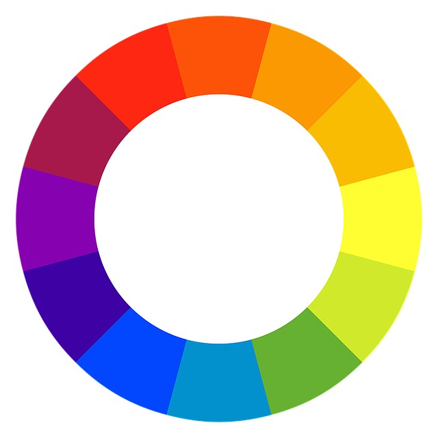
The Basics of Color Temperature
The basics of color temperature are essential to understanding the difference between cool and warm colors. When it comes to color, temperature refers to the perceived warmth or coolness of a hue.
Warm colors such as red, orange, and yellow are associated with heat and fire. They evoke feelings of energy, passion, and excitement.
On the other hand, cool colors like blue, green, and purple are reminiscent of water and nature. They tend to create a sense of calmness, tranquility, and relaxation.
Understanding color temperature is crucial in art, design, and even home decor. By using the right combination of warm and cool colors, you can create different moods and atmospheres in your space.
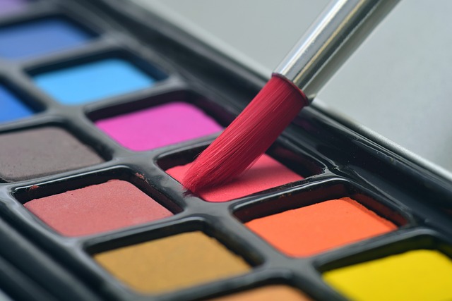
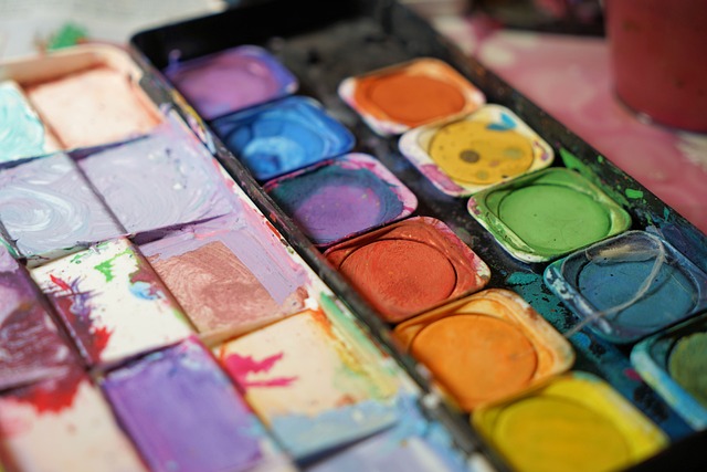
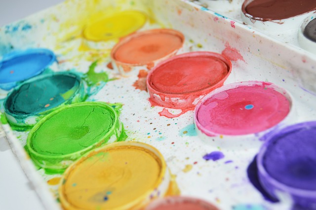
Cool Colors and Their Characteristics
When it comes to cool colors, think of shades like blues, greens, and purples. These hues are examples of cool colors and are known for their calming effect on the mind and body.
You can find cool colors in nature, such as the ocean and the sky, as well as in art, where they are often used to create a sense of tranquility and relaxation.
Examples of cool colors
Take a look at these examples of cool colors, like blues and greens, that can create a calm and soothing atmosphere in your space.
- Blues:
- Sky blue: evokes a sense of tranquility and serenity, perfect for bedrooms or meditation spaces.
- Turquoise: brings a refreshing and invigorating feel, ideal for bathrooms or coastal-themed rooms.
- Greens:
- Mint green: promotes a sense of freshness and renewal, great for kitchens or study areas.
- Sage green: instills a feeling of balance and harmony, perfect for living rooms or offices.
By incorporating these cool colors into your decor, you can transform your space into a peaceful sanctuary. Imagine coming home to a bedroom painted in sky blue, where you can relax and unwind after a long day. Or envision a kitchen adorned in mint green, where you can prepare meals in a soothing and inviting environment.
These cool colors have the power to create a calming atmosphere that will bring tranquility and harmony to your everyday life.
How cool colors create a calming effect
Imagine walking into a room painted in tranquil shades of blue and green. Instantly, you feel a sense of calm wash over you. Cool colors, such as blues, greens, and purples, have the power to create a peaceful and serene atmosphere. The soothing nature of these hues can help reduce stress, anxiety, and even lower blood pressure.
When surrounded by cool colors, your mind and body automatically start to relax. The softness of the blues and the freshness of the greens create a sense of tranquility, making you feel at ease. It’s almost like being in a peaceful oasis, where worries and troubles fade away.
Cool colors in nature and art
Contrastingly, warm colors like red and orange evoke feelings of energy and excitement. When you see these vibrant hues, you can’t help but feel a surge of adrenaline. They have the power to grab your attention and make you feel alive.
Think about a beautiful sunset, with its fiery reds and oranges painting the sky. It fills you with a sense of awe and wonder. In art, warm colors are often used to create a focal point or to convey intense emotions. They can make a painting feel lively and energetic.
Warm Colors and Their Characteristics
You can easily identify warm colors by their vibrant and energetic characteristics. Warm colors include hues such as red, orange, and yellow. These colors are often associated with feelings of warmth, happiness, and excitement. When used in art or design, warm colors tend to grab attention and create a sense of movement. They can make objects appear closer and more prominent. In nature, warm colors are commonly found in sunsets, autumn leaves, and fiery landscapes. The table below provides a visual representation of warm colors and their corresponding hex codes:
| Color | Hex Code |
|---|---|
| Red | #FF0000 |
| Orange | #FFA500 |
| Yellow | #FFFF00 |
Understanding the characteristics of warm colors can help you effectively use them in your artwork or design projects.
Color Associations and Symbolism
Color associations and symbolism play a significant role in art and design, as they have the ability to influence the emotions and messages conveyed. When certain colors are seen, they often elicit specific feelings and ideas. This impact on perception can be observed in various ways:
- Cultural associations: Colors hold different meanings across cultures. For example, red is commonly associated with love and passion in Western cultures, whereas in some Eastern cultures, it symbolizes luck and prosperity.
- Personal associations: Colors can also trigger personal memories and experiences. For instance, the color blue might remind someone of a calm ocean or a peaceful sky, creating a sense of tranquility and relaxation.
Understanding these associations and symbols enables artists and designers to strategically use color to effectively convey their intended messages and emotions. By harnessing the power of color, they can create impactful and memorable visual experiences for their audience.
Using Cool Colors in Design
When incorporating cool colors into your design, consider the calming and soothing effect they can have on the viewer. Cool colors, such as blues, greens, and purples, evoke a sense of tranquility and relaxation. They can create a serene atmosphere and promote a feeling of peace and harmony.
By using cool colors in your design, you can help to create a space that is visually appealing and promotes a sense of calmness. Whether it’s a bedroom, a living room, or an office space, incorporating cool colors can help to create a more peaceful and inviting environment.
So next time you’re planning a design project, don’t forget to consider the power of cool colors to create a calm and soothing atmosphere.
Using Warm Colors in Design
To create a cozy and inviting atmosphere in your design, consider incorporating warm colors like reds, oranges, and yellows. These hues have the power to evoke feelings of warmth, energy, and positivity.
Imagine walking into a room bathed in a rich shade of red or a vibrant orange. Instantly, you feel a sense of comfort and excitement. Warm colors have the ability to make a space feel more intimate and welcoming.
They can be used to create focal points or to add depth and dimension to a room. Whether you choose to use warm colors as accents or as the main color scheme, they will undoubtedly infuse your design with a sense of warmth and charm.
Color Temperature in Art
Contrasting shades of blue and orange create a dynamic visual effect in art. When you look at a painting that incorporates these colors, you can immediately feel the energy and vibrancy.
The coolness of the blue hues brings a sense of calmness and tranquility, while the warmth of the orange hues adds a burst of excitement and passion. This combination of cool and warm colors creates a striking contrast that captures your attention and engages your senses.
It’s like watching a dance between two opposing forces, each enhancing the other’s beauty. Whether it’s a serene landscape with a bright orange sunset or an abstract piece with bold blue and orange shapes, the use of contrasting shades in art adds depth, emotion, and visual interest.
Applying Color Temperature in Photography
When it comes to photography, using cool colors can help you create a sense of distance in your images. By incorporating blues and greens, you can make the viewer feel like they are looking at a scene from afar.
On the other hand, warm colors like reds and oranges can bring a sense of intimacy to your photographs, making the viewer feel closer to the subject.
Understanding how color temperature works can greatly enhance your storytelling in photography, allowing you to convey specific emotions and moods through the use of color.
Using cool colors to create a sense of distance
Using cool colors can give the impression of depth and distance in a painting. When you incorporate these hues into your artwork, you create a sense of space that draws the viewer in. Here are some ways you can achieve this effect:
- Color Temperature: Choose cool colors such as blues, purples, and greens to dominate the foreground of your painting. This will make the background appear further away, enhancing the sense of depth.
- Value Contrast: Vary the values of your cool colors to create contrast and depth. Use lighter shades in the foreground and gradually darken them as they recede into the distance. This technique adds visual complexity and enhances the illusion of depth.
Using warm colors to create a sense of intimacy
To create a sense of intimacy in your artwork, incorporate warm colors like reds, oranges, and yellows, which can evoke feelings of closeness and warmth. These vibrant hues have the power to create a cozy and inviting atmosphere, making viewers feel connected to your art on a deeper level. Warm colors are known to stimulate emotions and can be used strategically to highlight focal points or create a sense of depth in your composition. By using warm colors in your artwork, you can convey a sense of comfort, passion, and positive energy. So, whether you’re painting a soothing landscape or a lively portrait, consider incorporating warm colors to create an intimate and engaging experience for your audience.
| Warm Colors | Symbolism | Usage |
|---|---|---|
| Reds | Passion | Highlighting |
| Oranges | Energy | Focal Points |
| Yellows | Happiness | Creating Depth |
How color temperature can enhance storytelling in photography
Enhance the storytelling in your photography by playing with color temperature. By adjusting the color temperature, you have the power to create a specific atmosphere in your photographs. Warm colors, such as reds, oranges, and yellows, can bring a sense of energy and vibrancy to your images. These colors are often associated with feelings of warmth, joy, and excitement.
On the other hand, cool colors, like blues and greens, can create a calm and tranquil ambiance. These colors are often linked to feelings of serenity and relaxation.
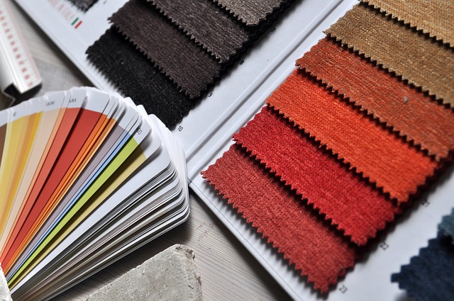
Color Temperature in Fashion and Clothing
When it comes to fashion and clothing, color temperature plays a crucial role in determining the overall vibe. You may not realize it, but the colors you choose to wear can have a significant impact on how you are perceived by others.
Cool colors, such as blues and greens, tend to create a calm and soothing atmosphere, while warm colors, like reds and yellows, evoke energy and excitement. By understanding the temperature of different hues, you can curate a wardrobe that reflects your desired mood and style.
Whether you want to appear professional and sophisticated or fun and playful, the right color temperature can help you achieve the look you want. So next time you’re picking out an outfit, remember to consider the role that color temperature plays in creating the overall impression you want to make.
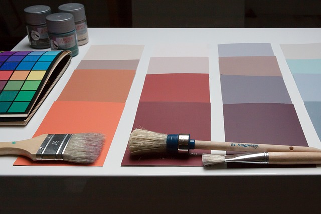
Color Temperature in Home Decor
Did you know that the color temperature of your home decor can greatly impact the overall atmosphere and mood of your living space?
The temperature of colors refers to their perceived warmth or coolness. Warm colors, such as reds, oranges, and yellows, can create a cozy and inviting atmosphere. They can make a room feel lively and energetic, perfect for social spaces like living rooms or dining areas.
On the other hand, cool colors like blues, greens, and purples can evoke a sense of calmness and relaxation. They are ideal for bedrooms or spaces where you want to promote tranquility.
Color Temperature in Marketing and Advertising
When it comes to marketing and advertising, understanding the impact of color temperature is crucial.
Cool colors like blues and greens can effectively convey trust and professionalism, making them ideal for industries such as finance and healthcare.
On the other hand, warm colors like reds and oranges can evoke excitement and urgency, making them perfect for industries like retail and entertainment.

It is important to choose the right color temperature based on your target audience and the message you want to convey in order to create a successful marketing campaign.
How cool colors can convey trust and professionalism
Cool colors can convey trust and professionalism, which is why they are often used in corporate branding. When it comes to creating a sense of reliability and competence, cool colors like blue and green are your go-to choices. Here’s why:
- Blue: This color is associated with calmness and stability. It instills a sense of trust and reliability in the minds of your audience, making it perfect for corporate logos and websites.
- Green: Symbolizing growth and harmony, green evokes a sense of balance and professionalism. Using this color in your branding can help establish a trustworthy and credible image.
How warm colors can evoke excitement and urgency
To create a sense of excitement and urgency, warm colors like red and orange are your go-to choices. These vibrant hues have the power to grab attention and stimulate the senses. When used strategically, they can effectively convey a sense of energy and urgency.
The color red, for example, is often associated with passion and intensity. It can create a feeling of urgency and prompt action. Orange, on the other hand, is a color that exudes enthusiasm and excitement. It can evoke a sense of anticipation and encourage people to take immediate action.
Whether you’re designing a poster, creating a call-to-action button, or planning a marketing campaign, incorporating warm colors can help you create a sense of excitement and urgency that will capture your audience’s attention.
Choosing the right color temperature for different target audiences
Using the appropriate color temperature for different target audiences can greatly impact the effectiveness of your design. By understanding the psychological effects of warm and cool colors, you can create a visual experience that resonates with your audience. Warm colors like red, yellow, and orange can evoke feelings of excitement, urgency, and energy, making them ideal for grabbing attention and promoting action. On the other hand, cool colors like blue, green, and purple can create a sense of calmness, trust, and stability, making them suitable for more professional or serious designs. To help you choose the right color temperature for your target audience, here is a handy table:
| Target Audience | Warm Color Temperature | Cool Color Temperature |
|---|---|---|
| Children | ✓ | |
| Seniors | ✓ | |
| Business | ✓ |
Conclusion: Harnessing the Power of Color Temperature
You can now see how understanding the temperature of colors can greatly impact your use of hues. By recognizing the difference between warm and cool colors, you can create powerful visual compositions that evoke specific emotions and convey messages effectively.
Warm colors like red, orange, and yellow can create a sense of warmth, energy, and excitement. They are perfect for grabbing attention and creating a focal point.
On the other hand, cool colors like blue, green, and purple can evoke calmness, serenity, and relaxation. They are ideal for creating a soothing and tranquil atmosphere.
Frequently Asked Questions
How does color temperature affect our emotions and mood?
Color temperature directly impacts your emotions and mood. Warm colors like red and orange evoke feelings of energy and excitement, while cool colors like blue and green create a sense of calm and relaxation.
What are some examples of color combinations that work well with cool colors?
Some examples of color combinations that work well with cool colors include blue and white, green and gray, and purple and silver. These combinations create a calming and serene atmosphere.
Are warm colors always associated with positive feelings and cool colors with negative feelings?
Warm colors are not always associated with positive feelings and cool colors with negative feelings. Color associations are highly subjective and can vary based on personal experiences and cultural backgrounds.
How does color temperature play a role in creating depth and dimension in artwork?
Color temperature plays a role in creating depth and dimension in artwork by using warm colors to bring elements forward and cool colors to push them back, giving the illusion of depth and creating a sense of space.
Can color temperature influence consumer behavior and purchasing decisions in marketing and advertising?
Color temperature can indeed influence consumer behavior and purchasing decisions in marketing and advertising. Warm colors like red and orange can create a sense of urgency and excitement, while cool colors like blue and green can evoke feelings of calmness and trust.
Conclusion
So now you understand the power of color temperature! By harnessing the cool and warm hues, you can create different moods and evoke specific emotions in your designs, fashion choices, and home decor.
Remember, cool colors like blues and greens are calming and soothing, while warm colors like reds and yellows are energizing and exciting.
Use this knowledge to your advantage in marketing and advertising, as color temperature can greatly impact consumer perception.
So go ahead, experiment with different temperatures and watch your creations come to life!