

The Power Of Color: How To Use Hues To Define Your Interior Style
You’ve probably heard the saying, ‘A picture is worth a thousand words.’ Well, when it comes to your home, the same can be said about color.
Imagine walking into a space that instantly evokes a sense of calm, or one that energizes and uplifts you. With the power of color, you can define your interior style and create a space that truly speaks to you.
In this article, we’ll show you how to use hues to transform your home and serve your unique taste.
Key Takeaways
- Color plays a crucial role in setting the tone and atmosphere of a room.
- Different colors can evoke different emotions and moods in a space.
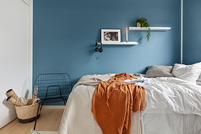
- Cool and muted colors like blue or green promote tranquility and relaxation.
- Neutral tones like beige or gray create a serene and focused environment.
Understanding Color Theory
To understand color theory, you’ll need to delve into the science behind how different hues interact and create visual harmony.
Color symbolism plays a significant role in interior design, as each color evokes specific emotions and meanings. For example, red represents passion and energy, while blue conveys calmness and tranquility.
By understanding the symbolism of colors, you can create a desired atmosphere and ambiance in your space.
Additionally, color harmony is crucial in achieving a balanced and pleasing interior style. It involves selecting colors that complement and enhance each other, creating a cohesive and unified look.
Whether you want a vibrant and energetic space or a calm and soothing one, mastering color theory will help you serve others by creating spaces that align with their desires and needs.
Choosing a Color Palette
When selecting colors for your home, it’s important to choose a cohesive color palette that complements each room. A well-chosen color palette can create a harmonious and inviting atmosphere, making your home a comfortable and welcoming space.
Here are some key points to consider when choosing your color palette:
- Emotional impact: Colors have the power to evoke emotions. Warm colors like red and orange can create a cozy and energetic vibe, while cool colors like blue and green can promote relaxation and calmness.
- Branding influence: Color psychology is not limited to interior design. It plays a significant role in branding as well. Different colors can communicate different messages and attract specific target audiences.
- Outdoor spaces: Don’t forget to incorporate color in your outdoor spaces. Bright and vibrant hues can make your garden or patio feel lively and joyful, encouraging you to spend more time in nature.
- Personal preference: Ultimately, choose colors that resonate with you and reflect your personal style. Your home should be a reflection of your personality and taste.
Creating a Cohesive Look with Complementary Colors
Creating a cohesive look with complementary colors can give your home a unified and harmonious feel. By incorporating color blocking techniques for a modern twist, you can create a visually striking and stylish interior.
Color blocking involves using contrasting colors in distinct, defined areas to create a bold and contemporary look. For example, you can paint one wall in a vibrant hue and leave the rest of the room neutral to make a statement.
Additionally, incorporating metallic accents can add depth and dimension to your space. Whether it’s a shiny copper vase or a gold-framed mirror, these metallic elements can bring a touch of elegance and sophistication to any room.
The Impact of Warm vs. Cool Colors
Choosing between warm and cool colors can significantly impact the overall mood and atmosphere of your space. Understanding warm vs. cool color psychology is crucial when designing your interior.
Warm colors like red, orange, and yellow evoke feelings of energy, warmth, and coziness. They create a vibrant and inviting ambiance, making your space feel lively and welcoming.
On the other hand, cool colors such as blue, green, and purple have a calming effect. They promote relaxation and tranquility, making your space feel serene and peaceful.
Additionally, the impact of color on spatial perception is worth considering. Warm colors tend to visually advance, making a room feel smaller, while cool colors recede, creating an illusion of more space.
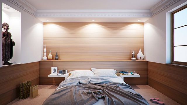
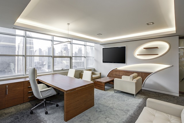
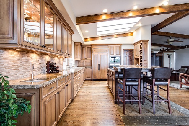
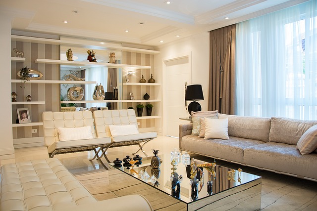
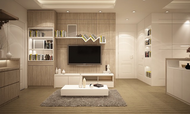
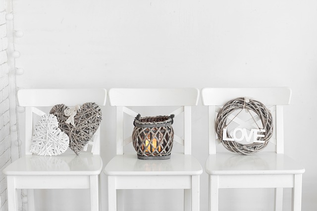
Using Neutrals for a Timeless Look
To achieve a timeless look, opt for neutrals in your space for a classic and elegant aesthetic. Neutrals provide a versatile foundation that can be easily incorporated into any design style.
Here are three ways you can maximize space with neutrals and incorporate them into different design styles:
- Neutral Color Palette: Choose shades of white, beige, and gray for your walls, furniture, and accessories. This creates a clean and cohesive look that visually enlarges the space.
- Texture and Pattern: Incorporate different textures and patterns in your neutral color scheme through fabrics, rugs, and wall coverings. This adds depth and visual interest to your space without overwhelming it.
- Accent Colors: Use neutral tones as a backdrop to highlight accent colors. By adding pops of color through artwork, pillows, or accessories, you can create a focal point and inject personality into your space.
Accentuating with Bold and Vibrant Colors
When it comes to accentuating with bold and vibrant colors, don’t shy away from incorporating eye-catching shades into your space. Embrace the power of color to make a bold statement and create a vibrant atmosphere that reflects your unique style.
Colors have deep meanings and symbolism, so choose hues that resonate with you and the message you want to convey. For example, fiery red can symbolize passion and energy, while soothing blue can evoke calmness and tranquility.
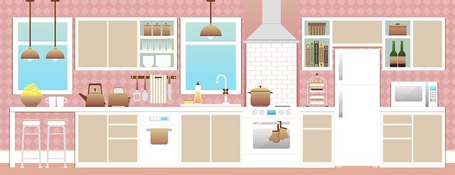
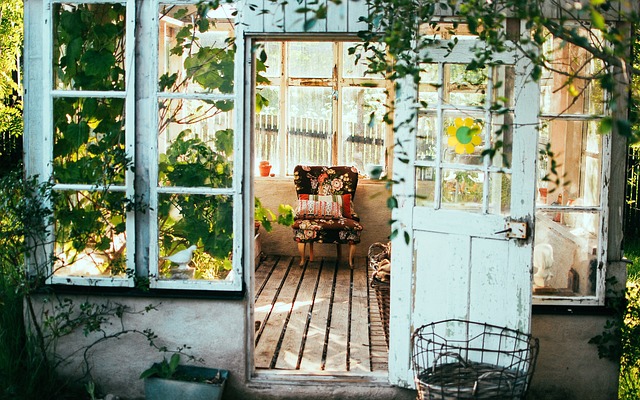
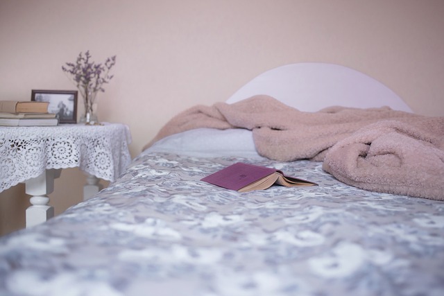
Creating a Relaxing Atmosphere with Soft and Pastel Hues
Transform your space into a serene oasis by embracing soft and pastel hues. These colors create a soothing and relaxing atmosphere. To create a cozy ambiance with warm hues, consider using monochromatic color schemes. Start by choosing a base color, such as a gentle shade of blue or a soft blush pink. Then, incorporate lighter and darker shades of the same color throughout your space.
Use warm tones like creamy whites and gentle yellows to add depth and warmth. Opt for soft furnishings in pastel shades, like lavender or mint green, to create a calming effect. Add finishing touches with accents in muted tones, such as pale gray or dusty rose.
Incorporating Patterns and Textures for Visual Interest
Get creative and experiment with different patterns and textures to add visual interest to your space. By incorporating geometric patterns and playing with different textures, you can transform any room into a visually captivating environment that reflects your unique style.
Here are three ideas to get you started:
- Mix and match: Combine different patterns, such as stripes, chevrons, and polka dots, to create a dynamic and playful look. Pair these patterns with contrasting textures, like velvet, leather, or faux fur, to add depth and dimension to your space.
- Statement pieces: Incorporate bold geometric patterns into your furniture or décor. A geometric rug, patterned wallpaper, or a statement artwork can instantly draw attention and become the focal point of the room.
- Textural layers: Layer different textures through textiles, such as cushions, throws, and curtains. Experiment with materials like silk, linen, wool, or even rattan to add tactile interest and create a cozy and inviting atmosphere.
Lighting and its Effect on Color Perception
To enhance the perception of colors in your space, consider how lighting can affect the overall ambiance and mood. Lighting effects play a crucial role in color perception. The right lighting can make colors appear more vibrant and intense, while the wrong lighting can dull their impact.
By understanding how different types of lighting can affect colors, you can create a space that truly reflects your desired style. For instance, warm lighting, such as incandescent bulbs, can enhance warm colors like reds and oranges, creating a cozy and inviting atmosphere. On the other hand, cool lighting, like fluorescent bulbs, can bring out cool colors like blues and greens, giving a space a more modern and refreshing feel.
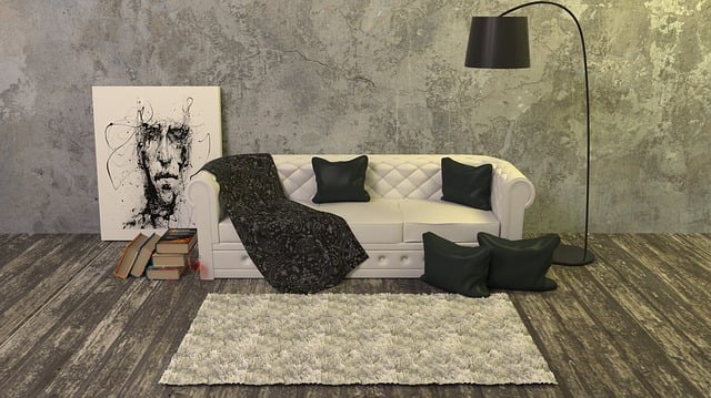
Creating Contrast with Light and Dark Shades
By strategically incorporating light and dark shades in your space, you can create a striking contrast that adds depth and visual interest.
Playing with light and shadow is a powerful way to create drama and evoke emotion in your interior design.
Darker shades can create a sense of intimacy and coziness, while lighter shades can make a space feel more open and airy.
Consider using a combination of light and dark hues on your walls, furniture, and accessories to create a dynamic and visually appealing space.
Experiment with different textures and finishes to enhance the contrast even further.
Whether you’re going for a bold and dramatic look or a more subtle and sophisticated style, contrasting shades will help you achieve the desired effect.
So go ahead, get creative, and let the power of light and dark shades transform your space into a work of art.
Using Color Psychology to Influence Mood
Using light and dark shades strategically can create a mood and evoke emotions in your space. When it comes to interior design, color plays a crucial role in setting the tone and atmosphere of a room. By exploring color symbolism in interior design, you can tap into the power of color psychology to influence mood and create a space that serves your needs.
Here are four ways you can use color to enhance productivity and creativity in different spaces:
- Energize with vibrant hues: Incorporate bold and bright colors like red or orange in your workspace to stimulate energy and creativity.
- Create calm with soothing shades: Use cool and muted colors like blue or green in your bedroom or relaxation area to promote tranquility and relaxation.
- Inspire focus with neutral tones: Opt for neutral colors like beige or gray in your study or office space to create a serene and focused environment.
- Boost positivity with warm hues: Add warm colors like yellow or pink in your living room or social areas to enhance social interaction and uplift spirits.
Tips for Experimenting with Color in Small Doses
Now that you understand how color can influence your mood, let’s explore some tips for experimenting with color in small doses.
By incorporating color in unexpected ways, you can create a unique and personalized interior style that reflects your personality.
One way to do this is by using accessories to add pops of color throughout your space. Consider adding colorful throw pillows to your sofa or chairs, or hanging vibrant artwork on your walls. You can also experiment with colorful rugs, curtains, or even small decorative objects like vases or candles.
These small touches of color can instantly transform a room and add visual interest. So don’t be afraid to think outside the box and let your creativity shine through by incorporating color through accessories.
Frequently Asked Questions
How do I choose the right color for my space?
To choose the right color for your space, consider these tips: for small spaces, opt for lighter colors to create the illusion of more space. Create a cohesive color palette by selecting colors that complement each other throughout your home.
What are the best colors to use in a small room to make it look bigger?
To make a small room look bigger, use color psychology to create a calming and spacious atmosphere. Lighter shades like pastels and neutrals can help open up the space. Also, consider the impact of lighting on color perception in interior design.
Can I use multiple colors in one room without it looking too busy?
Yes, you can use multiple colors in one room without it looking too busy. By using contrasting colors, you can create visual interest while still maintaining a cohesive color scheme.
How can I incorporate color trends into my home without it becoming outdated?
To keep up with color trends without your home looking outdated, choose timeless colors for your decor. Add pops of trendy accent colors through accessories, like throw pillows or artwork, for an updated look without a complete overhaul.
Are there certain colors that work better in specific rooms, such as the bedroom or living room?
Certain colors can have a greater impact on mood and productivity in specific rooms. For a calming bedroom environment, use color psychology to choose soothing hues like blues, greens, or neutrals.
Conclusion
Congratulations! You’ve unlocked the secret to unlocking the power of color in your interior style. By understanding color theory and choosing the right palette, you can create a cohesive and timeless look in your home.
Don’t be afraid to experiment with different hues and shades to create contrast and influence mood. Remember, the power of color is limitless, so go ahead and let your imagination run wild.
Get ready to transform your space into a vibrant and visually stunning masterpiece that will leave everyone in awe. The possibilities are as endless as the colors of the rainbow!