
Triadic Color Schemes

Infusing Vibrancy And Balance Into Your Space
Are you looking to bring vibrancy and balance into your interior space? Look no further than triadic color schemes.
By understanding and implementing these schemes, you can transform your home into a visually stunning and harmonious environment.
In this article, we’ll guide you through the process of choosing the right triadic color scheme for your space, applying it in different rooms, and using it to highlight architectural features.
Get ready to infuse your home with vibrant colors and create a truly captivating atmosphere.

Key Takeaways
- Combination of colors affects mood
- Triadic color schemes evoke energy and excitement
- Soft pastel triadic color schemes create a calming ambiance
- Triadic color schemes can create harmony, joy, and a sense of order in interior design.
Understanding Triadic Color Schemes
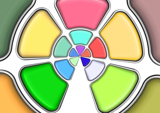
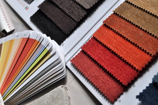
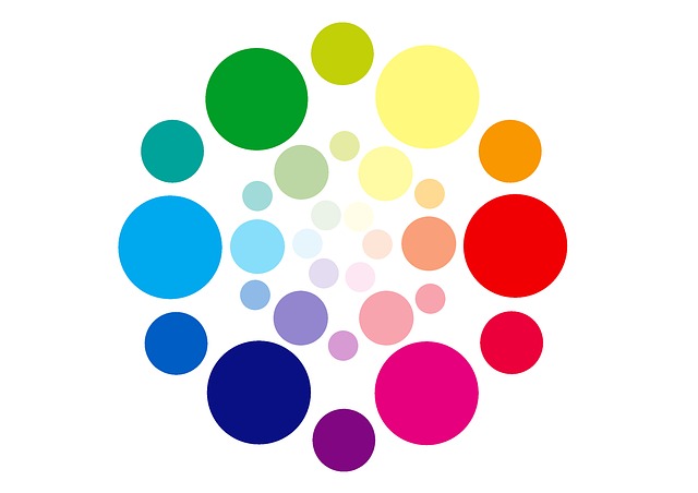
To understand triadic color schemes, you’ll need to learn about the harmonious combination of three colors evenly spaced on the color wheel. These color schemes are a great way to infuse vibrancy and balance into your interior space.
Triadic colors create a dynamic and visually appealing effect by using three colors that are equidistant from each other on the color wheel. For example, you can choose a combination of yellow, blue, and red, or green, orange, and purple.
The key to successfully using triadic color schemes is to ensure that the colors are balanced and not overpowering. By using a triadic color scheme, you can create a visually striking and harmonious space that will leave a lasting impression on anyone who enters.
Choosing the Right Triadic Color Scheme for Your Space
When choosing the right triadic color scheme for your space, it’s important to consider the mood and ambiance you want to create. Think about the emotions you want to evoke and the atmosphere you want to establish.
Additionally, focus on harmonizing different colors within the scheme to create a cohesive and visually pleasing look.
Lastly, consider tips for balancing the color intensity. Use neutrals as a base and incorporate pops of color strategically.
Consider the Mood and Ambiance
Creating a cozy and relaxing atmosphere is essential when designing your interior space. To truly evoke emotion in your audience, consider the mood and ambiance you want to create.
Here are two sub-lists to help you infuse the right emotions into your space:
- Warm and Inviting:
- Use warm colors like reds, oranges, and yellows to create a welcoming atmosphere.
- Incorporate soft lighting, such as warm-toned bulbs or candles, to add a cozy feel.
- Serene and Calming:

- Opt for cool colors like blues, greens, and purples to promote a tranquil environment.
- Introduce natural elements like plants or water features to enhance a sense of serenity.
Harmonizing Different Colors
By harmonizing different colors, you can create a visually appealing and cohesive interior space. Triadic color schemes are a great way to infuse vibrancy and balance into your home. This color scheme involves using three colors that are evenly spaced on the color wheel.
For example, you could combine blue, yellow, and red. By using these colors in your interior design, you can create a sense of harmony and unity. The key is to use one color as the dominant shade and the other two as accent colors. This will create a balanced look that is visually pleasing to the eye.

Tips for Balancing the Color Intensity
One way to achieve a visually pleasing interior is by ensuring a balanced color intensity in your design. By carefully selecting and combining colors of varying intensities, you can create a harmonious and dynamic space. To help you achieve this balance, here are some tips:
- Choose a dominant color: This color will set the tone for your space and should have a moderate intensity.
- Select secondary colors: Choose two colors that complement your dominant color, with one being slightly more intense and the other slightly less intense.
- Use accents: Add pops of color with accents like throw pillows, artwork, or rugs. These accents can have a higher or lower intensity compared to your dominant and secondary colors.

Remember, achieving balance is key. Too much intensity can overwhelm the space, while too little can make it feel dull. Experiment with different color combinations and intensities to find the perfect balance for your interior design.
| Intensity Level | Description | Examples |
|---|---|---|
| High | Bright and vibrant | Citrus orange, electric blue |
| Medium | Balanced and calming | Sky blue, sage green |
| Low | Subtle and muted | Pastel pink, light gray |
| Very Low | Soft and delicate | Champagne, pale lavender |
| Neutral | No specific intensity | White, beige |
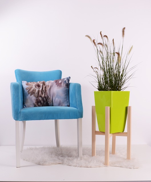
Applying Triadic Color Schemes in Different Rooms
When applying triadic color schemes in different rooms, it’s important to consider the overall mood and functionality of each space. To help you envision the perfect color scheme for your rooms, here are some ideas:
Living Room:
- Choose a triadic color scheme with warm tones like red, yellow, and blue-green to create a vibrant and inviting atmosphere.
- Use the dominant color on the walls and furniture, and the other two colors as accents in pillows, curtains, and artwork.
- Balance the intensity of the colors by incorporating neutral elements like a beige sofa or a white coffee table.
Bedroom:

- Opt for a triadic color scheme with soothing and calming shades such as lavender, mint green, and light blue.
- Paint the walls in a soft lavender hue and accentuate with mint green curtains and light blue bedding.
- Add pops of the other two colors with decorative pillows or artwork to create a harmonious and serene environment.
Home Office:
- For a productive and energizing space, go for a triadic color scheme with vibrant colors like orange, green, and purple.
- Paint one wall in a bold orange shade and use green and purple as accents in furniture and accessories.
- Balance the intensity of the colors with neutral elements like a white desk or gray shelves.
Creating Visual Interest with Triadic Color Accents
To add visual interest to your interior space, consider incorporating accents in three complementary colors. By using a triadic color scheme, you can infuse vibrancy and balance into your home decor.
Start by selecting a primary color and then choose two colors that are equidistant from it on the color wheel. For example, you could use a combination of red, blue, and yellow or purple, orange, and green. These colors will create a dynamic and harmonious look in your space.
Use the primary color as the dominant hue and the other two as accents. You can incorporate these colors through accessories like throw pillows, artwork, rugs, or even painted furniture. The key is to find a balance between the three colors to create a visually appealing and cohesive design.

Using Triadic Color Schemes to Highlight Architectural Features
Highlight architectural features in your home by incorporating accents in three complementary colors, creating a visually appealing and cohesive design. By using a triadic color scheme, you can infuse vibrancy and balance into your interior space, making it truly stand out.
Here are two ways you can use this technique to enhance your home:
- Choose three colors that are equidistant on the color wheel, such as red, yellow, and blue. This will create a harmonious and energetic atmosphere.
- Use one color as the dominant hue for your architectural feature, such as a vibrant blue for a statement wall, and then incorporate the other two colors in smaller accents, like throw pillows or artwork. This will draw attention to the feature while maintaining balance throughout the room.

With a triadic color scheme, you can transform your home into a space that showcases its architectural beauty in a captivating and stylish way.
Combining Triadic Color Schemes with Other Design Elements
Enhance the visual impact of your home’s architectural features by combining triadic color schemes with other design elements.
By incorporating complementary textures and patterns, you can create a cohesive and dynamic space.
Consider adding statement furniture pieces in contrasting colors to draw attention to specific architectural elements.
Pairing triadic color schemes with strategic lighting can further enhance the overall aesthetic appeal of your space.
Use accent lighting to highlight key architectural features, such as a unique staircase or a beautifully designed fireplace.
Additionally, incorporating elements such as artwork, rugs, and window treatments that complement the triadic color scheme can add depth and visual interest to your space.
Considering the Psychological Effects of Triadic Color Schemes
Considering the psychological effects, it’s important to understand how triadic color schemes can impact mood and emotions in your interior space.

By using three colors that are evenly spaced around the color wheel, triadic color schemes create a vibrant and balanced atmosphere. The combination of these colors can have a powerful effect on your mood.
For example, a triadic color scheme consisting of bold, primary colors like red, blue, and yellow can evoke feelings of energy and excitement. On the other hand, a triadic color scheme that incorporates softer, pastel hues like lavender, mint green, and light peach can create a calming and soothing ambiance.
Exploring Famous Examples of Triadic Color Schemes in Interior Design
When it comes to exploring famous examples of triadic color schemes in interior design, you can’t ignore the bold and vibrant style of Piet Mondrian. His use of primary colors and geometric shapes creates a dynamic and energetic atmosphere.
On the other hand, Josef Albers brings a timeless elegance to the table with his mastery of color theory and his ability to create harmonious compositions.

Lastly, the playful and whimsical designs of Charles and Ray Eames add a touch of fun to any space, with their innovative use of materials and iconic furniture designs.
The Bold and Vibrant Style of Piet Mondrian
The bold and vibrant style of Piet Mondrian brings a dynamic energy to any interior space. Incorporating his iconic geometric shapes and primary colors can transform a room into a work of art.
Imagine the impact his art can have on your home:
- Joy: Mondrian’s use of bold colors evokes feelings of happiness and excitement.

- Harmony: The balance between his geometric shapes creates a sense of order and tranquility.
- Creativity: His innovative style encourages you to think outside the box and experiment with your own interior design choices.
- Modernism: Mondrian’s work embodies the spirit of the modern art movement, adding a contemporary and sophisticated touch to your space.
The Timeless Elegance of Josef Albers
Imagine how Josef Albers’ timeless elegance can elevate your interior design, creating a space that exudes sophistication and refinement.

Albers, a renowned artist and educator, believed that color had the power to transform our perception of space and evoke emotional responses. By incorporating Albers’ principles of color theory into your interior design, you can create harmonious and visually pleasing environments.
Albers’ minimalist approach to design, coupled with his expert use of color, allows for a sense of balance and tranquility in any space. Whether you choose to incorporate his signature geometric patterns or simply draw inspiration from his color palette, Albers’ influence is sure to bring a touch of timeless elegance to your interior design.
Let his work guide you in creating a space that is both visually stunning and emotionally enriching.
The Playful and Whimsical Designs of Charles and Ray Eames
Experience the whimsical and playful designs of Charles and Ray Eames as they bring a sense of joy and creativity to your interior design. Their iconic furniture pieces and innovative approach to design have captured the hearts of many.
Here’s why you should consider incorporating their designs into your space:
- Timeless appeal:
The Eames’ designs have stood the test of time, remaining relevant and desirable even decades later. Their use of organic shapes and materials creates a timeless elegance that will never go out of style. - Functional yet beautiful:
Each piece is not only visually stunning but also carefully designed with functionality in mind. From their ergonomic chairs to their modular storage systems, the Eames’ designs seamlessly blend form and function, enhancing the usability of your space.
Tips for Implementing a Triadic Color Scheme Successfully
To successfully implement a triadic color scheme, you’ll need to carefully select three colors that are equally spaced on the color wheel. This will create a harmonious and balanced look in your interior space.

Start by choosing one color as your dominant hue and then select the other two colors as accents. For example, you could choose blue as your dominant color and then add in yellow and red as your accent colors. Remember to use different shades and tints of these colors to add depth and dimension to your design.
Additionally, consider the proportions of each color in your space. You want to achieve a balanced distribution of colors to avoid overwhelming or underwhelming effects.
Avoiding Common Mistakes with Triadic Color Schemes
Avoiding common mistakes with triadic color schemes can help you achieve a visually appealing and well-balanced design in your home. By understanding these mistakes and how to avoid them, you can create a harmonious and vibrant atmosphere that will leave a lasting impression on anyone who enters your space.
One common mistake is using colors that are too vibrant or intense. While triadic color schemes are meant to be bold and lively, it’s important to choose shades that are balanced and complementary. Avoid using colors that clash or overwhelm the space.

Another mistake is neglecting to consider the lighting in your home. Different lighting conditions can greatly affect how colors appear. Make sure to test your chosen colors in various lighting situations to ensure they still work well together.
Lastly, don’t forget about the importance of proportion. Balance is key when it comes to using triadic color schemes. Be mindful of how much of each color you incorporate into your design to avoid overwhelming the space.
By avoiding these common mistakes, you can confidently create a stunning and well-balanced triadic color scheme in your home.
| Common Mistakes | How to Avoid Them |
|---|---|
| Using intense colors | Choose balanced shades |
| Ignoring lighting | Test colors in different lighting conditions |
| Lack of proportion | Maintain balance |
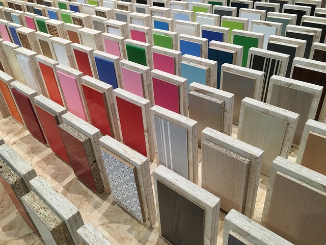
Inspiration for Triadic Color Schemes from Nature and Art
Now that you know how to avoid common mistakes with triadic color schemes, it’s time to draw inspiration from the beauty of nature and art.
Nature is a masterful artist, using triadic color schemes effortlessly in its creations. Think about the vibrant colors of a blooming garden or the breathtaking hues of a sunset. Take note of how these colors harmonize and create a sense of balance.
Art, too, can provide endless inspiration for triadic color schemes. From famous paintings to modern sculptures, artists have long understood the power of combining colors in a triadic way. Whether it’s the bold contrast of primary colors or the subtle harmony of secondary hues, art can guide you in infusing vibrancy and balance into your interior space.
So go out, explore nature, visit galleries, and let the colors of the world inspire you.
Final Thoughts on the Impact of Triadic Color Schemes
Take a moment to reflect on how triadic color schemes can enhance the overall impact and aesthetic of your design. By carefully selecting three colors that are equidistant on the color wheel, you can create a vibrant and balanced palette that captivates the eye.

Here are three reasons why triadic color schemes are a powerful tool in design:
- Harmony and Balance: Triadic color schemes offer a harmonious balance between contrasting hues. The three colors work together to create a sense of unity and cohesion in your design, resulting in a visually pleasing and well-balanced composition.
- Vibrancy and Contrast: The use of three contrasting colors in a triadic scheme injects a vibrant energy into your space. The bold combination of hues creates a striking visual impact and adds depth and dimension to your design, making it visually engaging and captivating.
- Flexibility and Versatility: Triadic color schemes provide a high level of versatility and flexibility. With three colors to work with, you have endless possibilities for creating different moods and atmospheres in your space. Whether you want to create a bold and energetic look or a more subdued and calming ambiance, triadic color schemes can adapt to your design needs.
Incorporating triadic color schemes into your design can elevate its overall impact and aesthetic, creating a visually stunning and captivating space that leaves a lasting impression.
Frequently Asked Questions
What are some alternative color schemes that can be used instead of a triadic color scheme?
Instead of a triadic color scheme, you can try a monochromatic scheme with varying shades of the same color for a harmonious look. Analogous schemes use colors next to each other on the color wheel for a cohesive feel.
Can a triadic color scheme be used in small spaces?
Yes, a triadic color scheme can be used in small spaces. It can bring vibrancy and balance to the area, making it visually appealing. By carefully selecting colors, you can create a cohesive and harmonious look in your compact space.
How can I incorporate a triadic color scheme into a minimalist design?
To incorporate a triadic color scheme into a minimalist design, focus on choosing three colors that are evenly spaced on the color wheel. Use them sparingly as accents, such as in artwork or decorative accessories, to maintain the clean and simple aesthetic of the space.

Are there any rules to follow when selecting the main color for a triadic color scheme?
When selecting the main color for a triadic color scheme, there are a few rules to follow. First, choose colors that are evenly spaced on the color wheel. Second, ensure that they complement each other harmoniously.
Can a triadic color scheme be used to create a soothing and calming atmosphere in a space?
Yes, a triadic color scheme can create a soothing and calming atmosphere in a space. By using colors that are evenly spaced on the color wheel, it brings balance and harmony to the room, promoting a sense of relaxation.
Conclusion
So there you have it! Triadic color schemes are a fantastic way to infuse vibrancy and balance into your interior space.
By understanding the principles behind these schemes and choosing the right colors for each room, you can create a visually stunning and harmonious environment.

Don’t forget to use triadic color accents to add visual interest and highlight architectural features.
And remember, with a little planning and attention to detail, you can successfully implement a triadic color scheme in your home.
So go ahead and get inspired by nature and art, and transform your space with the power of triadic colors!